
 EChart屬性說明
# ECharts Option屬性說明
提示
文件正在補充過程中,如需要檢視完整的最新的文件,請點選https://echarts.apache.org/zh/option.html (opens new window)。
ECharts的數據以及樣式均從option處輸入,所有的專案均以json的語法進行排列設定,關於JSON語法的說明可查閱JSON簡介 (opens new window)。
一級目錄下主要包含以下的專案。下列專案可按照選擇填入至option={}的括號中,完整的格式如下:
option ={
    title: {...} ,
    legend: {...} ,
    grid: {...} ,
    xAxis: {...} ,
    yAxis: {...} ,
    polar: {...} ,
    radiusAxis: {...} ,
    angleAxis: {...} ,
    radar: {...} ,
    dataZoom: [{...}] ,
    visualMap: [{...}] ,
    tooltip: {...} ,
    axisPointer: {...} ,
    toolbox: {...} ,
    brush: {...} ,
    geo: {...} ,
    parallel: {...} ,
    parallelAxis: {...} ,
    singleAxis: {...} ,
    timeline: {...} ,
    graphic: {...} ,
    calendar: {...} ,
    dataset: {...} ,
    aria: {...} ,
    series: [{...}] ,
    darkMode ...,
    color ...,
    backgroundColor: 'transparent' ,
    textStyle: {...} ,
    animation: true ,
    animationThreshold: 2000 ,
    animationDuration: 1000 ,
    animationEasing: cubicOut ,
    animationDelay: 0 ,
    animationDurationUpdate: 300 ,
    animationEasingUpdate: cubicInOut ,
    animationDelayUpdate: 0 ,
    stateAnimation: {...} ,
    blendMode: 'source-over' ,
    hoverLayerThreshold: 3000 ,
    useUTC: false ,
    options ...,
    media: [{...}] ,
}
2
3
4
5
6
7
8
9
10
11
12
13
14
15
16
17
18
19
20
21
22
23
24
25
26
27
28
29
30
31
32
33
34
35
36
37
38
39
40
41
42
43
44
45
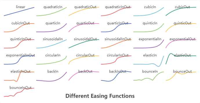
# 1. title
標題元件,包含主標題和副標題。例如下面不同緩動函式效果的示例,每一個緩動效果圖都帶有一個標題元件:
title目錄下主要包含以下專案,按照語法參考如下:
option = {
    title: {
        id ...,
        show: true ,
        text: '' ,
        link: '' ,
        target: 'blank' ,
        textStyle: {...} ,
        subtext: '' ,
        sublink: '' ,
        subtarget: 'blank' ,
        subtextStyle: {...} ,
        textAlign: 'auto' ,
        textVerticalAlign: 'auto' ,
        triggerEvent: false ,
        padding: 5 ,
        itemGap: 10 ,
        zlevel: 0 ,
        z: 2 ,
        left: 'auto' ,
        top: 'auto' ,
        right: 'auto' ,
        bottom: 'auto' ,
        backgroundColor: 'transparent' ,
        borderColor: '#ccc' ,
        borderWidth: 0 ,
        borderRadius: 0 ,
        shadowBlur ...,
        shadowColor ...,
        shadowOffsetX: 0 ,
        shadowOffsetY: 0 ,
    },
    ...
}
2
3
4
5
6
7
8
9
10
11
12
13
14
15
16
17
18
19
20
21
22
23
24
25
26
27
28
29
30
31
32
33
34
# 1.1. title.id
string
元件 ID。預設不指定。指定則可用於在 option 或者 API 中引用元件。
# 1.2. title.show
boolean
是否顯示標題元件。
# 1.3. title.text
string
主標題文字,支援使用\n換行。
# 1.4. title.link
string
主標題文字超鏈接。
# 1.5. title.target
string
指定視窗打開主標題超鏈接。
可選
'self'目前視窗打開'blank'新視窗打開
# 1.6. title.textStyle
Object
設定文字的樣式。
其中的屬性按照JSON語法排列格式如下:
option = {
    title: {
        textStyle: {
            color: '#333' ,
            fontStyle: 'normal' ,
            fontWeight: 'bolder' ,
            fontFamily: 'sans-serif' ,
            fontSize: 18 ,
            lineHeight ...,
            width ...,
            height ...,
            textBorderColor ...,
            textBorderWidth ...,
            textBorderType: 'solid' ,
            textBorderDashOffset: 0 ,
            textShadowColor: 'transparent' ,
            textShadowBlur: 0 ,
            textShadowOffsetX: 0 ,
            textShadowOffsetY: 0 ,
            overflow: 'none' ,
            ellipsis: '...' ,
            lineOverflow: 'none' ,
            rich: {...}
        } ,
        ...
    },
    ...
}
2
3
4
5
6
7
8
9
10
11
12
13
14
15
16
17
18
19
20
21
22
23
24
25
26
27
28
# 1.6.1. title.textStyle.color
Color
主標題文字的顏色。
- 用法:
title: {
    textStyle: {
        color: '#333'
    }
}
2
3
4
5
# 1.6.2. title.textStyle.fontStyle
string
主標題文字字型的風格。
可選
'normal':正常字型。'italic':斜體字型。'oblique':斜體字型。用法:
title: {
    textStyle: {
        fontStyle: 'normal'
    }
}
2
3
4
5
# 1.6.3. title.textStyle.fontWeight
string number
主標題文字字型的粗細。
可選
'normal''bold''bolder'lighter'100 | 200 | 300 | 400...用法:
title: {
    textStyle: {
        fontWeight: 'bolder'
    }
}
2
3
4
5
# 1.6.4. title.textStyle.fontFamily
string
主標題文字的字型系列。可以是 'sans-serif','serif' , 'monospace', 'Arial', 'Courier New', 'Microsoft YaHei', ...
- 用法:
title: {
    textStyle: {
        fontFamily: 'sans-serif'
    }
}
2
3
4
5
# 1.6.5. title.textStyle.fontSize
number
主標題文字的字型大小。
- 用法:
title: {
    textStyle: {
        fontSize: 18
    }
}
2
3
4
5
# 1.6.6. title.textStyle.lineHeight
number
主標題文字的行高。rich中如果沒有設定lineHeight,則會取父層級的lineHeight。例如:
{
    lineHeight: 56,
    rich: {
        a: {
            // 沒有設定 `lineHeight`,則 `lineHeight` 為 56
        }
    }
}
2
3
4
5
6
7
8
- 用法:
title: {
    textStyle: {
        lineHeight: 56
    }
}
2
3
4
5
# 1.6.7. title.textStyle.width
number
文字顯示寬度。
- 用法:
title: {
    textStyle: {
        width: 12
    }
}
2
3
4
5
# 1.6.8. title.textStyle.height
number
文字顯示高度。
- 用法:
title: {
    textStyle: {
        width: 18
    }
}
2
3
4
5
# 1.6.9. title.textStyle.textBorderColor
Color
文字本身的描邊顏色。
- 用法:
title: {
    textStyle: {
        textBorderColor: '#333'
    }
}
2
3
4
5
# 1.6.10. title.textStyle.textBorderWidth
number
文字本身的描邊寬度。
- 用法:
title: {
    textStyle: {
        textBorderWidth: 18
    }
}
2
3
4
5
# 1.6.11. title.textStyle.textBorderType
string number Array
文字本身的描邊型別。
可選
'solid':實心豎線。'dashed':短橫線。'dotted':點狀線。
自 v5.0.0 開始,也可以是 number 或者 number 陣列,用以指定線條的 dash array (opens new window),配合 textBorderDashOffset 可實現更靈活的虛線效果。
{
    textBorderType: [5, 10],
    textBorderDashOffset: 5
}
2
3
4
- 用法:
title: {
    textStyle: {
         textBorderType: 'dashed'
    }
}
2
3
4
5
# 1.6.12. title.textStyle.textBorderDashOffset
number
從
v5.0.0開始支援
用於設定虛線的偏移量,可搭配textBorderType指定 dash array 實現靈活的虛線效果。
更多詳情可以參考 MDN lineDashOffset (opens new window)。
- 用法:
title: {
    textStyle: {
         textBorderDashOffset: 0
    }
}
2
3
4
5
# 1.6.13. title.textStyle.textShadowColor
Color
文字本身的陰影顏色。
- 用法:
title: {
    textStyle: {
         textShadowColor: `transparent`
    }
}
2
3
4
5
# 1.6.14. title.textStyle.textShadowBlur
number
文字本身的陰影長度。
- 用法:
title: {
    textStyle: {
         textShadowBlur: 0
    }
}
2
3
4
5
# 1.6.15. title.textStyle.textShadowOffsetX
number
文字本身的陰影 X 偏移。
- 用法:
title: {
    textStyle: {
         textShadowOffsetX: 0
    }
}
2
3
4
5
# 1.6.16. title.textStyle.textShadowOffsetY
number
文字本身的陰影 Y 偏移。
- 用法:
title: {
    textStyle: {
         textShadowOffsetY: 0
    }
}
2
3
4
5
# 1.6.17. title.textStyle.overflow
string
文字超出寬度是否截斷或者換行。配置width時有效。
可選
none不換行。'truncate'截斷,並在末尾顯示ellipsis配置的文字,預設為...。'break'換行。'breakAll'換行,跟'break'不同的是,在英語等拉丁文中,'breakAll'還會強制單詞內換行用法:
title: {
    textStyle: {
         overflow: 'none'
    }
}
2
3
4
5
# 1.6.18. title.textStyle.ellipsis
string
在overflow配置為'truncate'的時候,可以通過該屬性配置末尾顯示的文字。
# 1.6.19. title.textStyle.lineOverflow
string
文字超出高度部分是否截斷,配置height時有效。
可選
'truncate'在文字行數超出高度部分截斷。用法:
title: {
    textStyle: {
         lineOverflow: 'none'
    }
}
2
3
4
5
# 1.6.20. title.textStyle.rich
Object
在 rich 裡面,可以自定義富文字樣式。利用富文字樣式,可以在標籤中做出非常豐富的效果。
label: {
    // 在文字中,可以對部分文字採用 rich 中定義樣式。
    // 這裡需要在文字中使用標記符號:
    // `{styleName|text content text content}` 標記樣式名。
    // 注意,換行仍是使用 '\n'。
    formatter: [
        '{a|這段文字採用樣式a}',
        '{b|這段文字採用樣式b}這段用預設樣式{x|這段用樣式x}'
    ].join('\n'),

    rich: {
        a: {
            color: 'red',
            lineHeight: 10
        },
        b: {
            backgroundColor: {
                image: 'xxx/xxx.jpg'
            },
            height: 40
        },
        x: {
            fontSize: 18,
            fontFamily: 'Microsoft YaHei',
            borderColor: '#449933',
            borderRadius: 4
        },
        ...
    }
}
2
3
4
5
6
7
8
9
10
11
12
13
14
15
16
17
18
19
20
21
22
23
24
25
26
27
28
29
30
# 1.6.20.1. title.textStyle.rich.<style_name>
Object
其中的<style_name>為自行命名的部分,現將其中的自命名部分的對象屬性語法展示如下:
option = {
    title: {
        textStyle: {
            rich: {
                <style_name>: {
                    color: "#fff" ,
                    fontStyle: 'normal' ,
                    fontWeight: normal ,
                    fontFamily: 'sans-serif' ,
                    fontSize: 12 ,
                    align ...,
                    verticalAlign ...,
                    lineHeight ...,
                    backgroundColor: 'transparent' ,
                    borderColor ...,
                    borderWidth: 0 ,
                    borderType: 'solid' ,
                    borderDashOffset: 0 ,
                    borderRadius: 0 ,
                    padding: 0 ,
                    shadowColor: 'transparent' ,
                    shadowBlur: 0 ,
                    shadowOffsetX: 0 ,
                    shadowOffsetY: 0 ,
                    width ...,
                    height ...,
                    textBorderColor ...,
                    textBorderWidth ...,
                    textBorderType: 'solid' ,
                    textBorderDashOffset: 0 ,
                    textShadowColor: 'transparent' ,
                    textShadowBlur: 0 ,
                    textShadowOffsetX: 0 ,
                    textShadowOffsetY: 0
                },
                ...
            },
            ...
        } ,
        ...
    },
    ...
}
2
3
4
5
6
7
8
9
10
11
12
13
14
15
16
17
18
19
20
21
22
23
24
25
26
27
28
29
30
31
32
33
34
35
36
37
38
39
40
41
42
43
# 1.6.20.1.1. title.textStyle.rich.<style_name>.color
Color
文字的顏色
# 1.6.20.1.2. title.textStyle.rich.<style_name>.fontStyle
string
文字字型的風格。
可選
'normal':正常字型。'italic':斜體字型。'oblique':斜體字型。
# 1.6.20.1.3. title.textStyle.rich.<style_name>.fontWeight
string number
文字字型的粗細。
可選
'normal''bold''bolder'lighter'100 | 200 | 300 | 400...
# 1.6.20.1.4. title.textStyle.rich.<style_name>.fontFamily
string
文字字型系列。可以是'sans-serif', 'serif' , 'monospace', 'Arial', 'Courier New', 'Microsoft YaHei', ...
# 1.6.20.1.5. title.textStyle.rich.<style_name>.fontSize
number
文字的字型大小。
# 1.6.20.1.6. title.textStyle.rich.<style_name>.align
string
文字水平對齊方式,預設自動。
可選
'left':左對齊。'center':中心對齊。'right':右對齊。
rich 中如果沒有設定 align,則會取父層級的 align。例如:
{
    align: right,
    rich: {
        a: {
            // 沒有設定 `align`,則 `align` 為 right
        }
    }
}
2
3
4
5
6
7
8
# 1.6.20.1.7. title.textStyle.rich.<style_name>.verticalAlign
string
文字垂直對齊方式,預設自動。
可選
'top':頂部對齊。'middle':垂直居中對齊。'bottom':底部對齊。
rich 中如果沒有設定 verticalAlign,則會取父層級的 verticalAlign。例如:
{
    verticalAlign: bottom,
    rich: {
        a: {
            // 沒有設定 `verticalAlign`,則 `verticalAlign` 為 bottom
        }
    }
}
2
3
4
5
6
7
8
# 1.6.20.1.8. title.textStyle.rich.<style_name>.lineHeight
number
行高。
rich 中如果沒有設定 lineHeight,則會取父層級的 lineHeight。例如:
{
    lineHeight: 56,
    rich: {
        a: {
            // 沒有設定 `lineHeight`,則 `lineHeight` 為 56
        }
    }
}
2
3
4
5
6
7
8
# 1.6.20.1.9. title.textStyle.rich.<style_name>.backgroundColor
string Object
文字塊背景色。
可以使用顏色值,例如:transparent,'#123234', 'red', 'rgba(0,23,11,0.3)'。
也可以直接使用圖片,例如:
backgroundColor: {
    image: 'xxx/xxx.png'
    // 這裡可以是圖片的 URL,
    // 或者圖片的 dataURI,
    // 或者 HTMLImageElement 對象,
    // 或者 HTMLCanvasElement 對象。
}
2
3
4
5
6
7
當使用圖片的時候,可以使用 width 或 height 指定高寬,也可以指定自適應。
# 1.6.20.1.10. title.textStyle.rich.<style_name>.borderColor
Color
文字塊邊框顏色。
# 1.6.20.1.11. title.textStyle.rich.<style_name>.borderWidth
number
文字邊框寬度。
# 1.6.20.1.12. title.textStyle.rich.<style_name>.borderType
string number Array
文字塊邊框描邊型別。
可選
'solid':實心豎線。'dashed':短橫線。'dotted':點狀線。
自 v5.0.0 開始,也可以是 number 或者 number 陣列,用以指定線條的 dash array (opens new window),配合 borderDashOffset 可實現更靈活的虛線效果。
{
    textBorderType: [5, 10],
    textBorderDashOffset: 5
}
2
3
4
# 1.6.20.1.13. title.textStyle.rich.<style_name>.borderDashOffset
number
從
v5.0.0開始支援
用於設定虛線的偏移量,可搭配borderType指定 dash array 實現靈活的虛線效果。
更多詳情可以參考 MDN lineDashOffset (opens new window)。
# 1.6.20.1.14. title.textStyle.rich.<style_name>.borderRadius
number Array
文字塊的圓角。
# 1.6.20.1.15. title.textStyle.rich.<style_name>.padding
number Array
文字塊的內邊距。例如:
padding: [3, 4, 5, 6]:表示[上, 右, 下, 左]的邊距。padding: 4:表示padding: [4, 4, 4, 4]。padding: [3, 4]:表示padding: [3, 4, 3, 4]。 注意,文字塊的width和height指定的是內容高寬,不包含padding。
# 1.6.20.1.16. title.textStyle.rich.<style_name>.shadowColor
Color
文字塊的背景陰影顏色。
# 1.6.20.1.17. title.textStyle.rich.<style_name>.shadowBlur
number
文字塊的背景陰影長度。
# 1.6.20.1.18. title.textStyle.rich.<style_name>.shadowOffsetX
number
文字塊的背景陰影 X 偏移。
# 1.6.20.1.19. title.textStyle.rich.<style_name>.shadowOffsetY
number
文字塊的背景陰影Y偏移。
# 1.6.20.1.20. title.textStyle.rich.<style_name>.width
number string
文字塊的寬度。一般不用指定,不指定則自動是文字的寬度。在想做表格項或者使用圖片(參見 backgroundColor)時,可能會使用它。
注意,文字塊的 width 和 height 指定的是內容高寬,不包含 padding。
width 也可以是百分比字串,如 '100%'。表示的是所在文字塊的 contentWidth(即不包含文字塊的 padding)的百分之多少。之所以以 contentWidth 做基數,因為每個文字片段只能基於 content box 佈局。如果以 outerWidth 做基數,則百分比的計算在實用中不具有意義,可能會超出。
注意,如果不定義 rich 屬性,則不能指定 width 和 height。
# 1.6.20.1.21. title.textStyle.rich.<style_name>.height
number string
文字塊的高度。一般不用指定,不指定則自動是文字的高度。在使用圖片(參見 backgroundColor)時,可能會使用它。
注意,文字塊的 width 和 height 指定的是內容高寬,不包含 padding。
注意,如果不定義 rich 屬性,則不能指定 width 和 height。
# 1.6.20.1.22. title.textStyle.rich.<style_name>.textBorderColor
Color
文字本身的描邊顏色。
# 1.6.20.1.23. title.textStyle.rich.<style_name>.textBorderWidth
number
文字本身的描邊寬度。
# 1.6.20.1.24. title.textStyle.rich.<style_name>.textBorderType
string number Array
文字本身的描邊型別。
可選
'solid':實心豎線。'dashed':短橫線。'dotted':點狀線。
自 v5.0.0 開始,也可以是 number 或者 number 陣列,用以指定線條的 dash array (opens new window),配合 textBorderDashOffset 可實現更靈活的虛線效果。
{
    textBorderType: [5, 10],
    textBorderDashOffset: 5
}
2
3
4
# 1.6.20.1.25. title.textStyle.rich.<style_name>.textBorderDashOffset
number
從
v5.0.0開始支援
用於設定虛線的偏移量,可搭配textBorderType指定 dash array 實現靈活的虛線效果。
更多詳情可以參考 MDN lineDashOffset (opens new window)。
# 1.6.20.1.26. title.textStyle.rich.<style_name>.textShadowColor
Color
文字本身的陰影顏色。
# 1.6.20.1.27. title.textStyle.rich.<style_name>.textShadowBlur
number
文字本身的陰影長度。
# 1.6.20.1.28. title.textStyle.rich.<style_name>.textShadowOffsetX
number
文字本身的陰影 X 偏移。
# 1.6.20.1.29. title.textStyle.rich.<style_name>.textShadowOffsetY
number
文字本身的陰影 Y 偏移。
# 1.7. title.subtext
string
副標題文字,支援使用 \n 換行。
- 用法:
title: {
    subtext: ''
}
2
3
# 1.8. title.sublink
string
副標題文字超鏈接。
- 用法:
title: {
    sublink: ''
}
2
3
# 1.9. title.subtarget
string
指定視窗打開副標題超鏈接。
可選
'self'目前視窗打開'blank'新視窗打開用法:
title: {
    subtarget: 'blank'
}
2
3
# 1.10. title.subtextStyle
Object
副標題的設定項,其中的專案按照JSON語法排列顯示如下:
option = {
    title: {
        subtextStyle: {
            color: '#aaa' ,
            fontStyle: 'normal' ,
            fontWeight: normal ,
            fontFamily: 'sans-serif' ,
            fontSize: 12 ,
            align ...,
            verticalAlign ...,
            lineHeight ...,
            width ...,
            height ...,
            textBorderColor ...,
            textBorderWidth ...,
            textBorderType: 'solid' ,
            textBorderDashOffset: 0 ,
            textShadowColor: 'transparent' ,
            textShadowBlur: 0 ,
            textShadowOffsetX: 0 ,
            textShadowOffsetY: 0 ,
            overflow: 'none' ,
            ellipsis: '...' ,
            lineOverflow: 'none' ,
            rich: {...}
        } ,
        ...
    },
    ...
}
2
3
4
5
6
7
8
9
10
11
12
13
14
15
16
17
18
19
20
21
22
23
24
25
26
27
28
29
30
# 1.10.1. title.subtextStyle.color
Color
副標題文字的顏色。
- 用法:
title: {
    subtextStyle: {
        color: '#333'
    }
}
2
3
4
5
# 1.10.2. title.subtextStyle.fontStyle
string
副標題文字字型的風格。
可選
'normal':正常字型。'italic':斜體字型。'oblique':斜體字型。用法:
title: {
    subtextStyle: {
        fontStyle: 'normal'
    }
}
2
3
4
5
# 1.10.3. title.subtextStyle.fontWeight
string number
副標題文字字型的粗細。
可選
'normal''bold''bolder'lighter'100 | 200 | 300 | 400...用法:
title: {
    subtextStyle: {
        fontWeight: 'bolder'
    }
}
2
3
4
5
# 1.10.4. title.subtextStyle.fontFamily
string
副標題文字的字型系列。可以是 'serif' , 'monospace', 'Arial', 'Courier New', 'Microsoft YaHei', ...
- 用法:
title: {
    subtextStyle: {
        fontFamily: 'sans-serif'
    }
}
2
3
4
5
# 1.10.5. title.subtextStyle.fontSize
number
副標題文字的字型大小。
- 用法:
title: {
    textStyle: {
        fontSize: 18
    }
}
2
3
4
5
# 1.10.6. title.subtextStyle.align
string
文字水平對齊方式,預設自動。
可選
'left':左對齊。'center':中心對齊。'right':右對齊。
rich 中如果沒有設定 align,則會取父層級的 align。例如:
{
    align: right,
    rich: {
        a: {
            // 沒有設定 `align`,則 `align` 為 right
        }
    }
}
2
3
4
5
6
7
8
- 用法:
title: {
    subtextStyle: {
        align: 'left'
    }
}
2
3
4
5
# 1.10.7. title.subtextStyle.verticalAlign
string
文字垂直對齊方式,預設自動。
可選
'top':頂部對齊。'middle':垂直居中對齊。'bottom':底部對齊。
rich 中如果沒有設定 verticalAlign,則會取父層級的 verticalAlign。例如:
{
    verticalAlign: bottom,
    rich: {
        a: {
            // 沒有設定 `verticalAlign`,則 `verticalAlign` 為 bottom
        }
    }
}
2
3
4
5
6
7
8
- 用法:
title: {
    subtextStyle: {
        verticalAlign: 'top'
    }
}
2
3
4
5
# 1.10.8. title.subtextStyle.lineHeight
number
行高。rich中如果沒有設定lineHeight,則會取父層級的lineHeight。例如:
{
    lineHeight: 56,
    rich: {
        a: {
            // 沒有設定 `lineHeight`,則 `lineHeight` 為 56
        }
    }
}
2
3
4
5
6
7
8
- 用法:
title: {
    textStyle: {
        lineHeight: 56
    }
}
2
3
4
5
# 1.10.9. title.subtextStyle.width
number
文字顯示寬度。
- 用法:
title: {
    subtextStyle: {
        width: 12
    }
}
2
3
4
5
# 1.10.10. title.subtextStyle.height
number
文字顯示高度。
- 用法:
title: {
    subtextStyle: {
        width: 18
    }
}
2
3
4
5
# 1.10.11. title.subtextStyle.textBorderColor
Color
文字本身的描邊顏色。
- 用法:
title: {
    subtextStyle: {
        textBorderColor: '#333'
    }
}
2
3
4
5
# 1.10.12. title.subtextStyle.textBorderWidth
number
文字本身的描邊寬度。
- 用法:
title: {
    subtextStyle: {
        textBorderWidth: 18
    }
}
2
3
4
5
# 1.10.13. title.subtextStyle.textBorderType
string number Array
文字本身的描邊型別。
可選
'solid':實心豎線。'dashed':短橫線。'dotted':點狀線。
自 v5.0.0 開始,也可以是 number 或者 number 陣列,用以指定線條的 dash array (opens new window),配合 textBorderDashOffset 可實現更靈活的虛線效果。
{
    textBorderType: [5, 10],
    textBorderDashOffset: 5
}
2
3
4
- 用法:
title: {
    subtextStyle: {
         textBorderType: 'dashed'
    }
}
2
3
4
5
# 1.10.14. title.subtextStyle.textBorderDashOffset
number
從
v5.0.0開始支援
用於設定虛線的偏移量,可搭配textBorderType指定 dash array 實現靈活的虛線效果。
更多詳情可以參考 MDN lineDashOffset (opens new window)。
- 用法:
title: {
    textStyle: {
         textBorderDashOffset: 0
    }
}
2
3
4
5
# 1.10.15. title.subtextStyle.textShadowColor
Color
文字本身的陰影顏色。
- 用法:
title: {
    subtextStyle: {
         textShadowColor: `transparent`
    }
}
2
3
4
5
# 1.10.16. title.subtextStyle.textShadowBlur
number
文字本身的陰影長度。
- 用法:
title: {
    subtextStyle: {
         textShadowBlur: 0
    }
}
2
3
4
5
# 1.10.17. title.subtextStyle.textShadowOffsetX
number
文字本身的陰影 X 偏移。
- 用法:
title: {
    subtextStyle: {
         textShadowOffsetX: 0
    }
}
2
3
4
5
# 1.10.18. title.subtextStyle.textShadowOffsetY
number
文字本身的陰影 Y 偏移。
- 用法:
title: {
    subtextStyle: {
         textShadowOffsetY: 0
    }
}
2
3
4
5
# 1.10.19. title.subtextStyle.overflow
string
文字超出寬度是否截斷或者換行。配置width時有效。
可選
none不換行。'truncate'截斷,並在末尾顯示ellipsis配置的文字,預設為...。'break'換行。'breakAll'換行,跟'break'不同的是,在英語等拉丁文中,'breakAll'還會強制單詞內換行用法:
title: {
    subtextStyle: {
         overflow: 'none'
    }
}
2
3
4
5
# 1.10.20. title.subtextStyle.ellipsis
string
在overflow配置為'truncate'的時候,可以通過該屬性配置末尾顯示的文字。
# 1.10.21. title.subtextStyle.lineOverflow
string
文字超出高度部分是否截斷,配置height時有效。
可選
'truncate'在文字行數超出高度部分截斷。用法:
title: {
    subtextStyle: {
         lineOverflow: 'none'
    }
}
2
3
4
5
# 1.10.22. title.subtextStyle.rich
Object
在 rich 裡面,可以自定義富文字樣式。利用富文字樣式,可以在標籤中做出非常豐富的效果。
label: {
    // 在文字中,可以對部分文字採用 rich 中定義樣式。
    // 這裡需要在文字中使用標記符號:
    // `{styleName|text content text content}` 標記樣式名。
    // 注意,換行仍是使用 '\n'。
    formatter: [
        '{a|這段文字採用樣式a}',
        '{b|這段文字採用樣式b}這段用預設樣式{x|這段用樣式x}'
    ].join('\n'),

    rich: {
        a: {
            color: 'red',
            lineHeight: 10
        },
        b: {
            backgroundColor: {
                image: 'xxx/xxx.jpg'
            },
            height: 40
        },
        x: {
            fontSize: 18,
            fontFamily: 'Microsoft YaHei',
            borderColor: '#449933',
            borderRadius: 4
        },
        ...
    }
}
2
3
4
5
6
7
8
9
10
11
12
13
14
15
16
17
18
19
20
21
22
23
24
25
26
27
28
29
30
# 1.10.22.1. title.subtextStyle.rich.<style_name>
Object
其中的<style_name>為自行命名的部分,現將其中的自命名部分的對象屬性語法展示如下:
option = {
    title: {
        subtextStyle: {
            rich: {
                <style_name>: {
                    color: "#fff" ,
                    fontStyle: 'normal' ,
                    fontWeight: normal ,
                    fontFamily: 'sans-serif' ,
                    fontSize: 12 ,
                    align ...,
                    verticalAlign ...,
                    lineHeight ...,
                    backgroundColor: 'transparent' ,
                    borderColor ...,
                    borderWidth: 0 ,
                    borderType: 'solid' ,
                    borderDashOffset: 0 ,
                    borderRadius: 0 ,
                    padding: 0 ,
                    shadowColor: 'transparent' ,
                    shadowBlur: 0 ,
                    shadowOffsetX: 0 ,
                    shadowOffsetY: 0 ,
                    width ...,
                    height ...,
                    textBorderColor ...,
                    textBorderWidth ...,
                    textBorderType: 'solid' ,
                    textBorderDashOffset: 0 ,
                    textShadowColor: 'transparent' ,
                    textShadowBlur: 0 ,
                    textShadowOffsetX: 0 ,
                    textShadowOffsetY: 0
                },
                ...
            },
            ...
        } ,
        ...
    },
    ...
}
2
3
4
5
6
7
8
9
10
11
12
13
14
15
16
17
18
19
20
21
22
23
24
25
26
27
28
29
30
31
32
33
34
35
36
37
38
39
40
41
42
43
# 1.10.22.1.1. title.subtextStyle.rich.<style_name>.color
Color
文字的顏色
# 1.10.22.1.2. title.subtextStyle.rich.<style_name>.fontStyle
string
文字字型的風格。
可選
'normal':正常字型。'italic':斜體字型。'oblique':斜體字型。
# 1.10.22.1.3. title.subtextStyle.rich.<style_name>.fontWeight
string number
文字字型的粗細。
可選
'normal''bold''bolder'lighter'100 | 200 | 300 | 400...
# 1.10.22.1.4. title.subtextStyle.rich.<style_name>.fontFamily
string
文字字型系列。可以是'sans-serif', 'serif' , 'monospace', 'Arial', 'Courier New', 'Microsoft YaHei', ...
# 1.10.22.1.5. title.subtextStyle.rich.<style_name>.fontSize
number
文字的字型大小。
# 1.10.22.1.6. title.subtextStyle.rich.<style_name>.align
string
文字水平對齊方式,預設自動。
可選
'left':左對齊。'center':中心對齊。'right':右對齊。
rich 中如果沒有設定 align,則會取父層級的 align。例如:
{
    align: right,
    rich: {
        a: {
            // 沒有設定 `align`,則 `align` 為 right
        }
    }
}
2
3
4
5
6
7
8
# 1.10.22.1.7. title.subtextStyle.rich.<style_name>.verticalAlign
string
文字垂直對齊方式,預設自動。
可選
'top''middle''bottom'
rich 中如果沒有設定 verticalAlign,則會取父層級的 verticalAlign。例如:
{
    verticalAlign: bottom,
    rich: {
        a: {
            // 沒有設定 `verticalAlign`,則 `verticalAlign` 為 bottom
        }
    }
}
2
3
4
5
6
7
8
# 1.10.22.1.8. title.subtextStyle.rich.<style_name>.lineHeight
number
行高。
rich 中如果沒有設定 lineHeight,則會取父層級的 lineHeight。例如:
{
    lineHeight: 56,
    rich: {
        a: {
            // 沒有設定 `lineHeight`,則 `lineHeight` 為 56
        }
    }
}
2
3
4
5
6
7
8
# 1.10.22.1.9. title.subtextStyle.rich.<style_name>.backgroundColor
string Object
文字塊背景色。
可以使用顏色值,例如:transparent,'#123234', 'red', 'rgba(0,23,11,0.3)'。
也可以直接使用圖片,例如:
backgroundColor: {
    image: 'xxx/xxx.png'
    // 這裡可以是圖片的 URL,
    // 或者圖片的 dataURI,
    // 或者 HTMLImageElement 對象,
    // 或者 HTMLCanvasElement 對象。
}
2
3
4
5
6
7
當使用圖片的時候,可以使用 width 或 height 指定高寬,也可以指定自適應。
# 1.10.22.1.10. title.subtextStyle.rich.<style_name>.borderColor
Color
文字塊邊框顏色。
# 1.10.22.1.11. title.subtextStyle.rich.<style_name>.borderWidth
number
文字邊框寬度。
# 1.10.22.1.12. title.subtextStyle.rich.<style_name>.borderType
string number Array
文字塊邊框描邊型別。
可選
'solid':實心豎線。'dashed':短橫線。'dotted':點狀線。
自 v5.0.0 開始,也可以是 number 或者 number 陣列,用以指定線條的 dash array (opens new window),配合 borderDashOffset 可實現更靈活的虛線效果。
{
    textBorderType: [5, 10],
    textBorderDashOffset: 5
}
2
3
4
# 1.10.22.1.13. title.subtextStyle.rich.<style_name>.borderDashOffset
number
從
v5.0.0開始支援
用於設定虛線的偏移量,可搭配borderType指定 dash array 實現靈活的虛線效果。
更多詳情可以參考 MDN lineDashOffset (opens new window)。
# 1.10.22.1.14. title.subtextStyle.rich.<style_name>.borderRadius
number Array
文字塊的圓角。
# 1.10.22.1.15. title.textStyle.rich.<style_name>.padding
number Array
文字塊的內邊距。例如:
padding: [3, 4, 5, 6]:表示[上, 右, 下, 左]的邊距。padding: 4:表示padding: [4, 4, 4, 4]。padding: [3, 4]:表示padding: [3, 4, 3, 4]。 注意,文字塊的width和height指定的是內容高寬,不包含padding。
# 1.10.22.1.16. title.subtextStyle.rich.<style_name>.shadowColor
Color
文字塊的背景陰影顏色。
# 1.10.22.1.17. title.subtextStyle.rich.<style_name>.shadowBlur
number
文字塊的背景陰影長度。
# 1.10.22.1.18. title.subtextStyle.rich.<style_name>.shadowOffsetX
number
文字塊的背景陰影 X 偏移。
# 1.10.22.1.19. title.subtextStyle.rich.<style_name>.shadowOffsetY
number
文字塊的背景陰影Y偏移。
# 1.10.22.1.20. title.subtextStyle.rich.<style_name>.width
number string
文字塊的寬度。一般不用指定,不指定則自動是文字的寬度。在想做表格項或者使用圖片(參見 backgroundColor)時,可能會使用它。
注意,文字塊的 width 和 height 指定的是內容高寬,不包含 padding。
width 也可以是百分比字串,如 '100%'。表示的是所在文字塊的 contentWidth(即不包含文字塊的 padding)的百分之多少。之所以以 contentWidth 做基數,因為每個文字片段只能基於 content box 佈局。如果以 outerWidth 做基數,則百分比的計算在實用中不具有意義,可能會超出。
注意,如果不定義 rich 屬性,則不能指定 width 和 height。
# 1.10.22.1.21. title.subtextStyle.rich.<style_name>.height
number string
文字塊的高度。一般不用指定,不指定則自動是文字的高度。在使用圖片(參見 backgroundColor)時,可能會使用它。
注意,文字塊的 width 和 height 指定的是內容高寬,不包含 padding。
注意,如果不定義 rich 屬性,則不能指定 width 和 height。
# 1.10.22.1.22. title.subtextStyle.rich.<style_name>.textBorderColor
Color
文字本身的描邊顏色。
# 1.10.22.1.23. title.subtextStyle.rich.<style_name>.textBorderWidth
number
文字本身的描邊寬度。
# 1.10.22.1.24. title.subtextStyle.rich.<style_name>.textBorderType
string number Array
文字本身的描邊型別。
可選
'solid':實心豎線。'dashed':短橫線。'dotted':點狀線。
自 v5.0.0 開始,也可以是 number 或者 number 陣列,用以指定線條的 dash array (opens new window),配合 textBorderDashOffset 可實現更靈活的虛線效果。
{
    textBorderType: [5, 10],
    textBorderDashOffset: 5
}
2
3
4
# 1.10.22.1.25. title.subtextStyle.rich.<style_name>.textBorderDashOffset
number
從
v5.0.0開始支援
用於設定虛線的偏移量,可搭配textBorderType指定 dash array 實現靈活的虛線效果。
更多詳情可以參考 MDN lineDashOffset (opens new window)。
# 1.10.22.1.26. title.subtextStyle.rich.<style_name>.textShadowColor
Color
文字本身的陰影顏色。
# 1.10.22.1.27. title.subtextStyle.rich.<style_name>.textShadowBlur
number
文字本身的陰影長度。
# 1.10.22.1.28. title.subtextStyle.rich.<style_name>.textShadowOffsetX
number
文字本身的陰影 X 偏移。
# 1.10.22.1.29. title.subtextStyle.rich.<style_name>.textShadowOffsetY
number
文字本身的陰影 Y 偏移。
# 1.11. title.textAlign
string
整體(包括 text 和 subtext)的水平對齊。
可選
'auto':自動對齊。'left':左對齊。'right':右對齊。'center':水平居中對齊。用法:
title: {
    textAlign: 'auto'
}
2
3
# 1.12. title.textVerticalAlign
string
整體(包括 text 和 subtext)的垂直對齊。
可選
''auto':自動對齊。'top':頂部對齊。'bottom':底部對齊。'middle':居中對齊。用法:
title: {
    textVerticalAlign: 'auto'
}
2
3
# 1.13. title.triggerEvent
boolean
是否觸發事件。
- 用法:
title: {
    triggerEvent: true
}
2
3
# 1.14. title.padding
number Array
標題內邊距,單位px,預設各方向內邊距為5,接受陣列分別設定上右下左邊距。
使用示例:
// 設定內邊距為 5
padding: 5
// 設定上下的內邊距為 5,左右的內邊距為 10
padding: [5, 10]
// 分別設定四個方向的內邊距
padding: [
    5,  // 上
    10, // 右
    5,  // 下
    10, // 左
]
2
3
4
5
6
7
8
9
10
11
- 用法:
title: {
    padding: 5
}
2
3
# 1.15. title.itemGap
number
主副標題之間的間距。
- 用法:
title: {
    itemGap: 5
}
2
3
# 1.16. title.zlevel
number
所有圖形的 zlevel 值。
zlevel用於 Canvas 分層,不同zlevel值的圖形會放置在不同的 Canvas 中,Canvas 分層是一種常見的優化手段。我們可以把一些圖形變化頻繁(例如有動畫)的元件設定成一個單獨的zlevel。需要注意的是過多的 Canvas 會引起記憶體開銷的增大,在手機端上需要謹慎使用以防崩潰。
zlevel 大的 Canvas 會放在 zlevel 小的 Canvas 的上面。
- 用法:
title: {
    zlevel: 6
}
2
3
# 1.17. title.z
number
元件的所有圖形的z值。控制圖形的前後順序。z值小的圖形會被z值大的圖形覆蓋。
z相比zlevel優先順序更低,而且不會建立新的 Canvas。
- 用法:
title: {
    z: 6
}
2
3
# 1.18. title.left
string number
title 元件離容器左側的距離。
left 的值可以是像 20 這樣的具體畫素值,可以是像 '20%' 這樣相對於容器高寬的百分比,也可以是 'left', 'center', 'right'。
如果left的值為'left', 'center', 'right',元件會根據相應的位置自動對齊。
- 用法:
title: {
    left: 'auto'
}
2
3
# 1.19. title.top
string number
title 元件離容器上側的距離。
top 的值可以是像 20 這樣的具體畫素值,可以是像 '20%' 這樣相對於容器高寬的百分比,也可以是 'left', 'center', 'right'。
如果left的值為'left', 'center', 'right',元件會根據相應的位置自動對齊。
- 用法:
title: {
    top: 'auto'
}
2
3
# 1.20. title.right
string number
title 元件離容器右側的距離。
right 的值可以是像 20 這樣的具體畫素值,可以是像'20%' 這樣相對於容器高寬的百分比。
預設自適應。
- 用法:
title: {
    right: 'auto'
}
2
3
# 1.21. title.bottom
string number
title 元件離容底側的距離。
right 的值可以是像 20 這樣的具體畫素值,可以是像'20%' 這樣相對於容器高寬的百分比。
預設自適應。
- 用法:
title: {
    bottom: 'auto'
}
2
3
# 1.22. title.backgroundColor
Color
標題背景色,預設透明。
顏色可以使用
RGB表示,比如'rgb(128, 128, 128)',如果想要加上 alpha 通道,可以使用 RGBA,比如'rgba(128, 128, 128, 0.5)',也可以使用十六進制格式,比如'#ccc'
- 用法:
title: {
    backgroundColor: 'rgba(128, 128, 128, 0.5)'
}
2
3
# 1.23. title.borderColor
Color
標題的邊框顏色。支援的顏色格式同 backgroundColor。
- 用法:
title: {
    borderColor: 'rgba(128, 128, 128, 0.5)'
}
2
3
# 1.24. title.borderWidth
number
標題的邊框線寬。
- 用法:
title: {
    borderWidth: 1
}
2
3
# 1.25. title.borderRadius
number Array
圓角半徑,單位px,支援傳入陣列分別指定 4 個圓角半徑。 如:
borderRadius: 5, // 統一設定四個角的圓角大小
borderRadius: [5, 5, 0, 0] //(順時針左上,右上,右下,左下)
2
- 用法:
title: {
    borderRadius: 5
}
2
3
# 1.26. title.shadowBlur
number
圖形陰影的模糊大小。該屬性配合 shadowColor,shadowOffsetX, shadowOffsetY 一起設定圖形的陰影效果。
示例:
{
    shadowColor: 'rgba(0, 0, 0, 0.5)',
    shadowBlur: 10
}
2
3
4
- 用法:
title: {
    shadowBlur: 5
}
2
3
# 1.27. title.shadowColor
Color
陰影顏色。支援的格式同color。注意:此配置項生效的前提是,設定了 show: true。
- 用法:
title: {
    shadowColor: '#333'
}
2
3
# 1.28. title.shadowOffsetX
number
陰影水平方向上的偏移距離。注意:此配置項生效的前提是,設定了 show: true。
- 用法:
title: {
    shadowOffsetX: 2
}
2
3
# 1.29. title.shadowOffsetY
number
陰影垂直方向上的偏移距離。注意:此配置項生效的前提是,設定了 show: true。
- 用法:
title: {
    shadowOffsetY: 2
}
2
3
# 2. legend
圖例元件。
圖例元件展現了不同系列的標記(symbol),顏色和名字。可以通過點選圖例控制哪些系列不顯示。
ECharts 3 中單個 echarts 實體中可以存在多個圖例元件,會方便多個圖例的佈局。
當圖例數量過多時,可以使用 滾動圖例(垂直) (opens new window) 或 滾動圖例(水平) (opens new window),參見:legend.type
其中的屬性按照JSON語法排列格式如下:
option = {
    lengend: {
        type ...,
        id ...,
        show: true ,
        zlevel: 0 ,
        z: 2 ,
        left: 'auto' ,
        top: 'auto' ,
        right: 'auto' ,
        bottom: 'auto' ,
        width: 'auto' ,
        height: 'auto' ,
        orient: 'horizontal' ,
        align: 'auto' ,
        padding: 5 ,
        itemGap: 10 ,
        itemWidth: 25 ,
        itemHeight: 14 ,
        itemStyle: {...} ,
        lineStyle: {...} ,
        formatter ...,
        selectedMode: true ,
        inactiveColor: '#ccc' ,
        inactiveBorderColor: '#ccc' ,
        inactiveBorderWidth: 'auto' ,
        selected ...,
        textStyle: {...} ,
        tooltip ...,
        icon ...,
        data: [{...}] ,
        backgroundColor: 'transparent' ,
        borderColor: '#ccc' ,
        borderWidth: 1 ,
        borderRadius: 0 ,
        shadowBlur ...,
        shadowColor ...,
        shadowOffsetX: 0 ,
        shadowOffsetY: 0 ,
        scrollDataIndex: 0 ,
        pageButtonItemGap: 5 ,
        pageButtonGap ...,
        pageButtonPosition: 'end' ,
        pageFormatter: '{current}/{total}' ,
        pageIcons: {...} ,
        pageIconColor: '#2f4554' ,
        pageIconInactiveColor: '#aaa' ,
        pageIconSize: 15 ,
        pageTextStyle: {...} ,
        animation ...,
        animationDurationUpdate: 800 ,
        emphasis: {...} ,
        selector: false ,
        selectorLabel: {...} ,
        selectorPosition: 'auto' ,
        selectorItemGap: 7 ,
        selectorButtonGap: 10
    },
    ...
}
2
3
4
5
6
7
8
9
10
11
12
13
14
15
16
17
18
19
20
21
22
23
24
25
26
27
28
29
30
31
32
33
34
35
36
37
38
39
40
41
42
43
44
45
46
47
48
49
50
51
52
53
54
55
56
57
58
59
60
# 2.1. lengend.type
string
圖例的型別。可選值:
'plain':普通圖例。預設就是普通圖例。'scroll':可滾動翻頁的圖例。當圖例數量較多時就可以使用。
參見滾動圖例(垂直) (opens new window) 或 滾動圖例(水平) (opens new window)。
當使用'scroll'時,使用這些設定進行細節配置。
- legend.scrollDataIndex
- legend.pageButtonItemGap
- legend.pageButtonGap
- legend.pageButtonPosition
- legend.pageFormatter
- legend.pageIcons
- legend.pageIconColor
- legend.pageIconInactiveColor
- legend.pageIconSize
- legend.pageTextStyle
- legend.animation
- legend.animationDurationUpdate
# 2.2. legend.id
string
元件 ID。預設不指定。指定則可用於在 option 或者 API 中引用元件。
# 2.3. legend.show
boolean
是否顯示圖例。
legend: {
    show: true
}
2
3
# 2.4. legend.zlevel
number
所有圖形的 zlevel 值。
zlevel用於 Canvas 分層,不同zlevel值的圖形會放置在不同的 Canvas 中,Canvas 分層是一種常見的優化手段。我們可以把一些圖形變化頻繁(例如有動畫)的元件設定成一個單獨的zlevel。需要注意的是過多的 Canvas 會引起記憶體開銷的增大,在手機端上需要謹慎使用以防崩潰。
zlevel 大的 Canvas 會放在 zlevel 小的 Canvas 的上面。
- 用法:
legend: {
    zlevel: 6
}
2
3
# 2.5. title.z
number
元件的所有圖形的z值。控制圖形的前後順序。z值小的圖形會被z值大的圖形覆蓋。
z相比zlevel優先順序更低,而且不會建立新的 Canvas。
- 用法:
legend: {
    z: 6
}
2
3
# 2.6. legend.left
string number
圖例元件離容器左側的距離。
left 的值可以是像 20 這樣的具體畫素值,可以是像 '20%' 這樣相對於容器高寬的百分比,也可以是 'left', 'center', 'right'。
如果left的值為'left', 'center', 'right',元件會根據相應的位置自動對齊。
- 用法:
lengend: {
    left: 'auto'
}
2
3
# 2.7. lengend.top
string number
圖例元件離容器上側的距離。
top 的值可以是像 20 這樣的具體畫素值,可以是像 '20%' 這樣相對於容器高寬的百分比,也可以是 'left', 'center', 'right'。
如果left的值為'left', 'center', 'right',元件會根據相應的位置自動對齊。
- 用法:
lengend: {
    top: 'auto'
}
2
3
# 2.8. legend.right
string number
圖例元件離容器右側的距離。
right 的值可以是像 20 這樣的具體畫素值,可以是像'20%'這樣相對於容器高寬的百分比。
預設自適應。
- 用法:
lengend: {
    right: 'auto'
}
2
3
# 2.9. legend.bottom
string number
圖例元件離容器下側的距離。
bottom 的值可以是像 20 這樣的具體畫素值,可以是像 '20%' 這樣相對於容器高寬的百分比。
預設自適應。
- 用法:
lengend: {
    bottom: 'auto'
}
2
3
# 2.10. legend.width
string number
圖例元件的寬度,預設自適應。
- 用法:
lengend: {
    width: 'auto'
}
2
3
# 2.11. legend.height
string number
圖例元件的高度。預設自適應。
- 用法:
lengend: {
    height: 'auto'
}
2
3
# 2.12. legend.orient
string
圖例列表的佈局朝向。預設值為'horizontal'。
可選
'horizontal':水平朝向佈局。'vertical':垂直朝向佈局。用法:
lengend: {
    orient: 'horizontal'
}
2
3
# 2.13. lengend.align
string
圖例標記和文字的對齊。預設自動,根據元件的位置和 orient 決定,當元件的 left 值為 'right' 以及縱向佈局(orient 為 'vertical')的時候為右對齊,即為 'right'。
可選
'auto':自適應。'left':左對齊。'right':右對齊。用法:
lengend: {
    align: 'auto'
}
2
3
# 2.14. legend.padding
number Array
圖例內邊距,單位px,預設各方向內邊距為5,接受陣列分別設定上右下左邊距。
使用示例:
// 設定內邊距為 5
padding: 5
// 設定上下的內邊距為 5,左右的內邊距為 10
padding: [5, 10]
// 分別設定四個方向的內邊距
padding: [
    5,  // 上
    10, // 右
    5,  // 下
    10, // 左
]
2
3
4
5
6
7
8
9
10
11
- 用法:
lengend: {
    padding: 5
}
2
3
# 2.15. legend.itemGap
number
圖例每項之間的間隔。橫向佈局時為水平間隔,縱向佈局時為縱向間隔。
- 用法:
lengend: {
    itemGap: 10
}
2
3
# 2.16. legend.itemWidth
number
圖例標記的圖形寬度。
- 用法:
lengend: {
    itemWidth: 25
}
2
3
# 2.17. legend.itemHeight
number
圖例標記的圖形高度。
- 用法:
lengend: {
    itemHeight: 14
}
2
3
# 2.18. legend.itemStyle
Object
圖例的圖形樣式。其屬性的取值為 'inherit' 時,表示繼承系列中的屬性值。
其中的設定項按照JSON語法排列顯示如下:
option = {
    lengend: {
        itemStyle: {
            color: inherit ,
            borderColor: inherit ,
            borderWidth: auto ,
            borderType: inherit ,
            borderDashOffset: inherit ,
            borderCap: inherit ,
            borderJoin: inherit ,
            borderMiterLimit: inherit ,
            shadowBlur: 0 ,
            shadowColor ...,
            shadowOffsetX: 0 ,
            shadowOffsetY: 0 ,
            opacity: inherit ,
            decal: inherit
        } ,
        ...
    },
    ...
}
2
3
4
5
6
7
8
9
10
11
12
13
14
15
16
17
18
19
20
21
22
# 2.18.1. legend.itemStyle.color
Color
圖形的顏色。
顏色可以使用 RGB 表示,比如
'rgb(128, 128, 128)',如果想要加上 alpha 通道表示不透明度,可以使用 RGBA,比如'rgba(128, 128, 128, 0.5)',也可以使用十六進制格式,比如'#ccc'。除了純色之外顏色也支援漸變色和紋理填充。
// 線性漸變,前四個參數分別是 x0, y0, x2, y2, 範圍從 0 - 1,相當於在圖形包圍盒中的百分比,如果 globalCoord 為 `true`,則該四個值是絕對的畫素位置
color: {
    type: 'linear',
    x: 0,
    y: 0,
    x2: 0,
    y2: 1,
    colorStops: [{
        offset: 0, color: 'red' // 0% 處的顏色
    }, {
        offset: 1, color: 'blue' // 100% 處的顏色
    }],
    global: false // 預設為 false
}
// 徑向漸變,前三個參數分別是圓心 x, y 和半徑,取值同線性漸變
color: {
    type: 'radial',
    x: 0.5,
    y: 0.5,
    r: 0.5,
    colorStops: [{
        offset: 0, color: 'red' // 0% 處的顏色
    }, {
        offset: 1, color: 'blue' // 100% 處的顏色
    }],
    global: false // 預設為 false
}
// 紋理填充
color: {
    image: imageDom, // 支援為 HTMLImageElement, HTMLCanvasElement,不支援路徑字串
    repeat: 'repeat' // 是否平鋪,可以是 'repeat-x', 'repeat-y', 'no-repeat'
}
2
3
4
5
6
7
8
9
10
11
12
13
14
15
16
17
18
19
20
21
22
23
24
25
26
27
28
29
30
31
32
# 2.18.2. legend.itemStyle.borderColor
Color
圖形的描邊顏色。支援的顏色格式同 color,不支援回撥函式。
# 2.18.3. legend.itemStyle.borderWidth
number
當其值為 "auto" 時,如果系列有 borderWidth 取 2,如果系列沒有 borderWidth 則取 0。當其值為 "inehrit" 時,始終取系列的 borderWidth。預設取值為inherit。
# 2.18.4. legend.itemStyle.borderType
string number Array
描邊型別。
可選
'solid':實心豎線。'dashed':短橫線。'dotted':點狀線。
自 v5.0.0 開始,也可以是 number 或者 number 陣列,用以指定線條的 dash array (opens new window),配合 borderDashOffset 可實現更靈活的虛線效果。
{
    borderType: [5, 10],
    borderDashOffset: 5
}
2
3
4
# 2.18.5. legend.itemStyle.borderDashOffset
number
從
v5.0.0開始支援
用於設定虛線的偏移量,可搭配textBorderType指定 dash array 實現靈活的虛線效果。
更多詳情可以參考 MDN lineDashOffset (opens new window)。
# 2.18.6. legend.itemStyle.borderCap
string
從
v5.0.0開始支援
用於指定線段末端的繪製方式,可以是:
'butt': 線段末端以方形結束。'round': 線段末端以圓形結束。'square': 線段末端以方形結束,但是增加了一個寬度和線段相同,高度是線段厚度一半的矩形區域。
預設值為 'butt'。 更多詳情可以參考 MDN lineCap (opens new window)。
# 2.18.7. legend.itemStyle.borderJoin
string
從
v5.0.0開始支援
用於設定2個長度不為0的相連部分(線段,圓弧,曲線)如何連線在一起的屬性(長度為0的變形部分,其指定的末端和控制點在同一位置,會被忽略)。
可以是:
'bevel': 在相連部分的末端填充一個額外的以三角形為底的區域, 每個部分都有各自獨立的矩形拐角。'round': 通過填充一個額外的,圓心在相連部分末端的扇形,繪製拐角的形狀。 圓角的半徑是線段的寬度。'miter': 通過延伸相連部分的外邊緣,使其相交於一點,形成一個額外的菱形區域。這個設定可以通過borderMiterLimit屬性看到效果。
預設值為 'bevel'。 更多詳情可以參考 MDN lineJoin (opens new window)。
# 2.18.8. legend.itemStyle.borderMiterLimit
number
從
v5.0.0開始支援
用於設定斜接面限制比例。只有當 borderJoin 為 miter 時, borderMiterLimit 才有效。
預設值為 10。負數、0、Infinity 和 NaN 均會被忽略。
更多詳情可以參考 MDN miterLimit (opens new window)。
# 2.18.9. legend.itemStyle.shadowBlur
number
圖形陰影的模糊大小。該屬性配合 shadowColor,shadowOffsetX, shadowOffsetY 一起設定圖形的陰影效果。
示例:
{
    shadowColor: 'rgba(0, 0, 0, 0.5)',
    shadowBlur: 10
}
2
3
4
# 2.18.10. legend.itemStyle.shadowColor
Color
陰影顏色。支援的格式同color。
# 2.18.11. legend.itemStyle.shadowOffsetX
number
陰影水平方向上的偏移距離。
# 2.18.12. legend.itemStyle.shadowOffsetY
number
陰影垂直方向上的偏移距離。
# 2.18.13. legend.itemStyle.opacity
number
圖形透明度。支援從 0 到 1 的數字,為 0 時不繪製該圖形。
# 2.18.14. legend.itemStyle.decal
Object
圖形的貼花圖案,在 aria.enabled 與 aria.decal.show 都是 true 的情況下才生效。
如果為none表示不使用貼圖案。
其中的選項按照JSON語法格式排列如下:
option = {
    lengend: {
        itemStyle: {
            decal: [{
                symbol: 'rect' ,
                symbolSize: 1 ,
                symbolKeepAspect: true ,
                color: 'rgba(0, 0, 0, 0.2)' ,
                backgroundColor ...,
                dashArrayX: 5 ,
                dashArrayY: 5 ,
                rotation: 0 ,
                maxTileWidth: 512 ,
                maxTileHeight: 512
            },
            ...
            ],
            ...
        } ,
        ...
    },
    ...
}
2
3
4
5
6
7
8
9
10
11
12
13
14
15
16
17
18
19
20
21
22
23
# 2.18.14.1. legend.itemStyle.decal.symbol
string Array
貼花的圖案,如果是string[] 表示循環使用陣列中的圖案。
ECharts 提供的標記型別包括:
'circle', 'rect', 'roundRect', 'triangle', 'diamond', 'pin', 'arrow', 'none'
可以通過 'image://url' 設定為圖片,其中 URL 為圖片的鏈接,或者 dataURI。
URL 為圖片鏈接例如:
'image://http://xxx.xxx.xxx/a/b.png'
URL為dataURI例如:
'image://data:image/gif;base64,R0lGODlhEAAQAMQAAORHHOVSKudfOulrSOp3WOyDZu6QdvCchPGolfO0o/XBs/fNwfjZ0frl3/zy7////wAAAAAAAAAAAAAAAAAAAAAAAAAAAAAAAAAAAAAAAAAAAAAAAAAAAAAAAAAAAAAAACH5BAkAABAALAAAAAAQABAAAAVVICSOZGlCQAosJ6mu7fiyZeKqNKToQGDsM8hBADgUXoGAiqhSvp5QAnQKGIgUhwFUYLCVDFCrKUE1lBavAViFIDlTImbKC5Gm2hB0SlBCBMQiB0UjIQA7'
可以通過 'path://' 將圖示設定為任意的向量路徑。這種方式相比于使用圖片的方式,不用擔心因為縮放而產生鋸齒或模糊,而且可以設定為任意顏色。路徑圖形會自適應調整為合適的大小。路徑的格式參見 SVG PathData (opens new window)。可以從 Adobe Illustrator 等工具編輯導出。
例如:
'path://M30.9,53.2C16.8,53.2,5.3,41.7,5.3,27.6S16.8,2,30.9,2C45,2,56.4,13.5,56.4,27.6S45,53.2,30.9,53.2z M30.9,3.5C17.6,3.5,6.8,14.4,6.8,27.6c0,13.3,10.8,24.1,24.101,24.1C44.2,51.7,55,40.9,55,27.6C54.9,14.4,44.1,3.5,30.9,3.5z M36.9,35.8c0,0.601-0.4,1-0.9,1h-1.3c-0.5,0-0.9-0.399-0.9-1V19.5c0-0.6,0.4-1,0.9-1H36c0.5,0,0.9,0.4,0.9,1V35.8z M27.8,35.8 c0,0.601-0.4,1-0.9,1h-1.3c-0.5,0-0.9-0.399-0.9-1V19.5c0-0.6,0.4-1,0.9-1H27c0.5,0,0.9,0.4,0.9,1L27.8,35.8L27.8,35.8z'
# 2.18.14.2. legend.itemStyle.decal.symbolSize
number
取值範圍:0 到 1,表示占圖案區域的百分比。
# 2.18.14.3. legend.itemStyle.decal.symbolKeepAspect
boolean
是否保持圖案的長寬比。
# 2.18.14.4. legend.itemStyle.decal.color
string
貼花圖案的顏色,建議使用半透明色,這樣能疊加在系列本身的顏色上。
# 2.18.14.5. legend.itemStyle.decal.backgroundColor
string
貼花的背景色,將會覆蓋在系列本身顏色之上,貼花圖案之下。
# 2.18.14.6. legend.itemStyle.decal.dashArrayX
number Array
貼花圖案的基本模式是在橫向和縱向上分別以圖案 - 空白 - 圖案 - 空白 - 圖案 - 空白的形式無限循環。通過設定每個圖案和空白的長度,可以實現複雜的圖案效果。
dashArrayX 控制了橫向的圖案模式。當其值為 number 或 number[] 型別時,與 SVG stroke-dasharray (opens new window) 類似。
如果是 number 型別,表示圖案和空白分別是這個值。如 5 表示先顯示寬度為 5 的圖案,然後空 5 畫素,再然後顯示寬度為 5 的圖案……
如果是 number[] 型別,則表示圖案和空白依次為陣列值的循環。如:[5, 10, 2, 6] 表示圖案寬 5 畫素,然後空 10 畫素,然後圖案寬 2 畫素,然後空 6 畫素,然後圖案寬 5 畫素……
如果是 (number | number[])[] 型別,表示每行的圖案和空白依次為陣列值的循環。如:[10, [2, 5]] 表示第一行以圖案 10 畫素空 10 畫素循環,第二行以圖案 2 畫素空 5 畫素循環,第三行以圖案 10 畫素空 10 畫素循環……
可以結合以下的例子理解本介面:
# 2.18.14.7. legend.itemStyle.decal.dashArrayY
number Array
貼花圖案的基本模式是在橫向和縱向上分別以圖案 - 空白 - 圖案 - 空白 - 圖案 - 空白的形式無限循環。通過設定每個圖案和空白的長度,可以實現複雜的圖案效果。
dashArrayX 控制了橫向的圖案模式。當其值為 number 或 number[] 型別時,與 SVG stroke-dasharray (opens new window) 類似。
如果是 number 型別,表示圖案和空白分別是這個值。如 5 表示先顯示寬度為 5 的圖案,然後空 5 畫素,再然後顯示寬度為 5 的圖案……
如果是 number[] 型別,則表示圖案和空白依次為陣列值的循環。如:[5, 10, 2, 6] 表示圖案寬 5 畫素,然後空 10 畫素,然後圖案寬 2 畫素,然後空 6 畫素,然後圖案寬 5 畫素……
如果是 (number | number[])[] 型別,表示每行的圖案和空白依次為陣列值的循環。如:[10, [2, 5]] 表示第一行以圖案 10 畫素空 10 畫素循環,第二行以圖案 2 畫素空 5 畫素循環,第三行以圖案 10 畫素空 10 畫素循環……
可以結合以下的例子理解本介面:
# 2.18.14.8. legend.itemStyle.decal.rotation
number
圖案的整體旋轉角度(弧度制),取值範圍從 -Math.PI 到 Math.PI。
# 2.18.14.9. legend.itemStyle.decal.maxTileWidth
number
產生的圖案在未重複之前的寬度上限。通常不需要設定該值,當你發現圖案在重複的時候出現不連續的接縫時,可以嘗試提高該值。
# 2.18.14.10. legend.itemStyle.decal.maxTileHeight
number
產生的圖案在未重複之前的高度上限。通常不需要設定該值,當你發現圖案在重複的時候出現不連續的接縫時,可以嘗試提高該值。
# 2.19. legend.lineStyle
Object
圖例圖形中線的樣式,用於諸如折線圖圖例橫線的樣式設定。其屬性的取值為 'inherit' 時,表示繼承系列中的屬性值。
此項中的選項按照JSON語法格式排列顯示如下:
option = {
    lengend: {
        lineStyle: {
            color: inherit ,
            width: auto ,
            type: inherit ,
            dashOffset: inherit ,
            cap: inherit ,
            join: inherit ,
            miterLimit: inherit ,
            shadowBlur: inherit ,
            shadowColor ...,
            shadowOffsetX: 0 ,
            shadowOffsetY: 0 ,
            opacity: inherit
        },
        ...
    },
    ...
}
2
3
4
5
6
7
8
9
10
11
12
13
14
15
16
17
18
19
20
# 2.19.1. legend.lineStyle.color
Color
線的顏色。
顏色可以使用 RGB 表示,比如
'rgb(128, 128, 128)',如果想要加上 alpha 通道表示不透明度,可以使用 RGBA,比如'rgba(128, 128, 128, 0.5)',也可以使用十六進制格式,比如'#ccc'。除了純色之外顏色也支援漸變色和紋理填充。
// 線性漸變,前四個參數分別是 x0, y0, x2, y2, 範圍從 0 - 1,相當於在圖形包圍盒中的百分比,如果 globalCoord 為 `true`,則該四個值是絕對的畫素位置
color: {
    type: 'linear',
    x: 0,
    y: 0,
    x2: 0,
    y2: 1,
    colorStops: [{
        offset: 0, color: 'red' // 0% 處的顏色
    }, {
        offset: 1, color: 'blue' // 100% 處的顏色
    }],
    global: false // 預設為 false
}
// 徑向漸變,前三個參數分別是圓心 x, y 和半徑,取值同線性漸變
color: {
    type: 'radial',
    x: 0.5,
    y: 0.5,
    r: 0.5,
    colorStops: [{
        offset: 0, color: 'red' // 0% 處的顏色
    }, {
        offset: 1, color: 'blue' // 100% 處的顏色
    }],
    global: false // 預設為 false
}
// 紋理填充
color: {
    image: imageDom, // 支援為 HTMLImageElement, HTMLCanvasElement,不支援路徑字串
    repeat: 'repeat' // 是否平鋪,可以是 'repeat-x', 'repeat-y', 'no-repeat'
}
2
3
4
5
6
7
8
9
10
11
12
13
14
15
16
17
18
19
20
21
22
23
24
25
26
27
28
29
30
31
32
# 2.19.2. legend.lineStyle.width
number
線寬。
# 2.19.3. legend.lineStyle.type
string number Array
線的型別。
可選
'solid':實心豎線。'dashed':短橫線。'dotted':點狀線。
自 v5.0.0 開始,也可以是 number 或者 number 陣列,用以指定線條的 dash array (opens new window),配合 textBorderDashOffset 可實現更靈活的虛線效果。
{
    type: [5, 10],
    dashOffset: 5
}
2
3
4
# 2.19.4. legend.lineStyle.dashOffset
number
從
v5.0.0開始支援
用於設定虛線的偏移量,可搭配 type 指定 dash array 實現靈活的虛線效果。
更多詳情可以參考 MDN lineDashOffset (opens new window)。
# 2.19.5. legend.lineStyle.cap
string
從
v5.0.0開始支援
用於指定線段末端的繪製方式,可以是:
'butt': 線段末端以方形結束。'round': 線段末端以圓形結束。'square': 線段末端以方形結束,但是增加了一個寬度和線段相同,高度是線段厚度一半的矩形區域。
預設值為 'butt'。 更多詳情可以參考 MDN lineCap (opens new window)。
# 2.19.6. legend.lineStyle.join
string
從
v5.0.0開始支援
用於設定2個長度不為0的相連部分(線段,圓弧,曲線)如何連線在一起的屬性(長度為0的變形部分,其指定的末端和控制點在同一位置,會被忽略)。
可以是:
'bevel': 在相連部分的末端填充一個額外的以三角形為底的區域, 每個部分都有各自獨立的矩形拐角。'round': 通過填充一個額外的,圓心在相連部分末端的扇形,繪製拐角的形狀。 圓角的半徑是線段的寬度。'miter': 通過延伸相連部分的外邊緣,使其相交於一點,形成一個額外的菱形區域。這個設定可以通過miterLimit屬性看到效果。
預設值為 'bevel'。 更多詳情可以參考 MDN lineJoin (opens new window)。
# 2.19.7. legend.lineStyle.miterLimit
number
從
v5.0.0開始支援
用於設定斜接面限制比例。只有當 borderJoin 為 miter 時, MiterLimit 才有效。
預設值為 10。負數、0、Infinity 和 NaN 均會被忽略。
更多詳情可以參考 MDN miterLimit (opens new window)。
# 2.19.8. legend.lineStyle.shadowBlur
number
圖形陰影的模糊大小。該屬性配合 shadowColor,shadowOffsetX, shadowOffsetY 一起設定圖形的陰影效果。
示例:
{
    shadowColor: 'rgba(0, 0, 0, 0.5)',
    shadowBlur: 10
}
2
3
4
# 2.19.9. legend.lineStyle.shadowColor
Color
陰影顏色。支援的格式同color。
# 2.19.10. legend.lineStyle.shadowOffsetX
number
陰影水平方向上的偏移距離。
# 2.19.11. legend.lineStyle.shadowOffsetY
number
陰影垂直方向上的偏移距離。
# 2.19.12. legend.lineStyle.opacity
number
圖形透明度。支援從 0 到 1 的數字,為 0 時不繪製該圖形。
# 2.20. legend.formatter
string Function
用來格式化圖例文字,支援字串模板和回撥函式兩種形式。
示例:
// 使用字串模板,模板變數為圖例名稱 {name}
formatter: 'Legend {name}'
// 使用回撥函式
formatter: function (name) {
    return 'Legend ' + name;
}
2
3
4
5
6
# 2.21. legend.selectedMode
string boolean
圖例選擇的模式,控制是否可以通過點選圖例改變系列的顯示狀態。預設開啟圖例選擇,可以設成 false 關閉。
除此之外也可以設成 'single' 或者 'multiple' 使用單選或者多選模式。
# 2.22. legend.inactiveColor
Color
圖例關閉時的顏色。
# 2.23. legend.inactiveBorderColor
Color
圖例關閉時的描邊顏色。
# 2.24. legend.inactiveBorderWidth
Color
圖例關閉時的描邊粗細。如果為 'auto' 表示:如果系列存在描邊,則取 2,如果系列不存在描邊,則取 0。如果為 'inherit' 則表示:始終取系列的描邊粗細。
# 2.25. legend.selected
Object
表示為圖例選中的狀態表。
示例:
selected: {
    // 選中'系列1'
    '系列1': true,
    // 不選中'系列2'
    '系列2': false
}
2
3
4
5
6
# 2.26. legend.textStyle
Object
圖例的公用文字樣式。
此項中的選項按照JSON語法格式排列顯示如下:
option = {
    lengend: {
        textStyle: {
            color: #333 ,
            fontStyle: 'normal' ,
            fontWeight: normal ,
            fontFamily: 'sans-serif' ,
            fontSize: 12 ,
            lineHeight ...,
            backgroundColor: 'transparent' ,
            borderColor ...,
            borderWidth: 0 ,
            borderType: 'solid' ,
            borderDashOffset: 0 ,
            borderRadius: 0 ,
            padding: 0 ,
            shadowColor: 'transparent' ,
            shadowBlur: 0 ,
            shadowOffsetX: 0 ,
            shadowOffsetY: 0 ,
            width ...,
            height ...,
            textBorderColor ...,
            textBorderWidth ...,
            textBorderType: 'solid' ,
            textBorderDashOffset: 0 ,
            textShadowColor: 'transparent' ,
            textShadowBlur: 0 ,
            textShadowOffsetX: 0 ,
            textShadowOffsetY: 0 ,
            overflow: 'none' ,
            ellipsis: '...' ,
            lineOverflow: 'none' ,
            rich: {...}
        },
        ...
    },
    ...
}
2
3
4
5
6
7
8
9
10
11
12
13
14
15
16
17
18
19
20
21
22
23
24
25
26
27
28
29
30
31
32
33
34
35
36
37
38
39
# 2.26.1. legend.textStyle.color
Color
文字的顏色。
# 2.26.2. legend.textStyle.fontStyle
string
文字字型的風格。
可選
'normal':正常字型'italic':斜體字型'oblique':斜體字型
# 2.26.3. legend.textStyle.fontWeight
string number
文字字型的粗細。
可選:
'normal''bold''bolder'lighter'100 | 200 | 300 | 400...
# 2.26.4. legend.textStyle.fontFamily
string
文字的字型系列。可以是 'sans-serif','serif' , 'monospace', 'Arial', 'Courier New', 'Microsoft YaHei', ...
# 2.26.5. legend.textStyle.fontSize
number
文字的字型大小。
# 2.26.6. legend.textStyle.lineHeight
number
行高。rich中如果沒有設定lineHeight,則會取父層級的lineHeight。例如:
{
    lineHeight: 56,
    rich: {
        a: {
            // 沒有設定 `lineHeight`,則 `lineHeight` 為 56
        }
    }
}
2
3
4
5
6
7
8
# 2.26.7. legend.textStyle.backgroundColor
string Object
文字塊背景色。
可以使用顏色值,例如:'#123234', 'red', 'rgba(0,23,11,0.3)'。
也可以直接使用圖片,例如:
backgroundColor: {
    image: 'xxx/xxx.png'
    // 這裡可以是圖片的 URL,
    // 或者圖片的 dataURI,
    // 或者 HTMLImageElement 對象,
    // 或者 HTMLCanvasElement 對象。
}
2
3
4
5
6
7
當使用圖片的時候,可以使用 width 或 height 指定高寬,也可以不指定自適應。
# 2.26.8. legend.textStyle.borderColor
Color
文字塊邊框顏色。
# 2.26.9. legend.textStyle.borderWidth
number
文字塊邊框寬度。
# 2.26.10. legend.textStyle.borderType
string number Array
文字塊邊框的描邊型別。
可選
'solid':實心豎線。'dashed':短橫線。'dotted':點狀線。
自 v5.0.0 開始,也可以是 number 或者 number 陣列,用以指定線條的 dash array (opens new window),配合 borderDashOffset 可實現更靈活的虛線效果。
{
    borderType: [5, 10],
    borderDashOffset: 5
}
2
3
4
# 2.26.11. legend.textStyle.borderDashOffset
number
從
v5.0.0開始支援
用於設定虛線的偏移量,可搭配 type 指定 dash array 實現靈活的虛線效果。
更多詳情可以參考 MDN lineDashOffset (opens new window)。
# 2.26.12. legend.textStyle.borderRadius
number Array
文字塊的圓角。
# 2.26.13. legend.textStyle.padding
number Array
文字塊的內邊距。例如:
padding: [3, 4, 5, 6]:表示[上, 右, 下, 左]的邊距。padding: 4:表示padding: [4, 4, 4, 4]。padding: [3, 4]:表示padding: [3, 4, 3, 4]。 注意,文字塊的width和height指定的是內容高寬,不包含padding。
# 2.26.14. legend.textStyle.shadowColor
Color
文字塊的背景陰影顏色。
# 2.26.15. legend.textStyle.shadowBlur
number
文字塊的背景陰影長度。
# 2.26.16. legend.textStyle.shadowOffsetX
number
文字塊的背景陰影 X 偏移。
# 2.26.17. legend.textStyle.shadowOffsetY
number
文字塊的背景陰影 Y 偏移。
# 2.26.18. legend.textStyle.width
number
文字顯示寬度。
# 2.26.19. legend.textStyle.height
number
文字顯示高度。
# 2.26.20. legend.textStyle.textBorderColor
Color
文字本身的描邊顏色。
# 2.26.21. legend.textStyle.textBorderWidth
number
文字本身的描邊寬度。
# 2.26.22. legend.textStyle.textBorderType
string number Array
文字本身的描邊型別。
可選
'solid':實心豎線。'dashed':短橫線。'dotted':點狀線。
自 v5.0.0 開始,也可以是 number 或者 number 陣列,用以指定線條的 dash array (opens new window),配合 textBorderDashOffset 可實現更靈活的虛線效果。
{
    textBorderType: [5, 10],
    textBorderDashOffset: 5
}
2
3
4
# 2.26.23. legend.textStyle.textBorderDashOffset
number
從
v5.0.0開始支援
用於設定虛線的偏移量,可搭配textBorderType指定 dash array 實現靈活的虛線效果。
更多詳情可以參考 MDN lineDashOffset (opens new window)。
# 2.26.24. legend.textStyle.textShadowColor
number
legend.textStyle.textShadowBlur
# 2.26.25. legend.textStyle.textShadowOffsetX
number
文字本身的陰影 X 偏移。
# 2.26.26. legend.textStyle.textShadowOffsetY
number
文字本身的陰影 Y 偏移。
# 2.26.27. legend.textStyle.overflow
string
文字超出寬度是否截斷或者換行。配置width時有效。
可選
none不換行。'truncate'截斷,並在末尾顯示ellipsis配置的文字,預設為...。'break'換行。'breakAll'換行,跟'break'不同的是,在英語等拉丁文中,'breakAll'還會強制單詞內換行
# 2.26.28. legend.textStyle.ellipsis
string
在overflow配置為'truncate'的時候,可以通過該屬性配置末尾顯示的文字。
# 2.26.29. legend.textStyle.lineOverflow
string
文字超出高度部分是否截斷,配置height時有效。
可選
'truncate'在文字行數超出高度部分截斷。用法:
title: {
    textStyle: {
         lineOverflow: 'none'
    }
}
2
3
4
5
# 2.26.30. legend.textStyle.rich
Object
在 rich 裡面,可以自定義富文字樣式。利用富文字樣式,可以在標籤中做出非常豐富的效果。
label: {
    // 在文字中,可以對部分文字採用 rich 中定義樣式。
    // 這裡需要在文字中使用標記符號:
    // `{styleName|text content text content}` 標記樣式名。
    // 注意,換行仍是使用 '\n'。
    formatter: [
        '{a|這段文字採用樣式a}',
        '{b|這段文字採用樣式b}這段用預設樣式{x|這段用樣式x}'
    ].join('\n'),

    rich: {
        a: {
            color: 'red',
            lineHeight: 10
        },
        b: {
            backgroundColor: {
                image: 'xxx/xxx.jpg'
            },
            height: 40
        },
        x: {
            fontSize: 18,
            fontFamily: 'Microsoft YaHei',
            borderColor: '#449933',
            borderRadius: 4
        },
        ...
    }
}
2
3
4
5
6
7
8
9
10
11
12
13
14
15
16
17
18
19
20
21
22
23
24
25
26
27
28
29
30
# 2.26.30.1. legend.textStyle.rich.<style_name>
Object
其中的<style_name>為自行命名的部分,現將其中的自命名部分的對象屬性語法展示如下:
option = {
    lengend: {
        textStyle: {
            rich: {
                <style_name>: {
                    color: "#fff" ,
                    fontStyle: 'normal' ,
                    fontWeight: normal ,
                    fontFamily: 'sans-serif' ,
                    fontSize: 12 ,
                    align ...,
                    verticalAlign ...,
                    lineHeight ...,
                    backgroundColor: 'transparent' ,
                    borderColor ...,
                    borderWidth: 0 ,
                    borderType: 'solid' ,
                    borderDashOffset: 0 ,
                    borderRadius: 0 ,
                    padding: 0 ,
                    shadowColor: 'transparent' ,
                    shadowBlur: 0 ,
                    shadowOffsetX: 0 ,
                    shadowOffsetY: 0 ,
                    width ...,
                    height ...,
                    textBorderColor ...,
                    textBorderWidth ...,
                    textBorderType: 'solid' ,
                    textBorderDashOffset: 0 ,
                    textShadowColor: 'transparent' ,
                    textShadowBlur: 0 ,
                    textShadowOffsetX: 0 ,
                    textShadowOffsetY: 0
                },
                ...
            },
            ...
        },
        ...
    },
    ...
}
2
3
4
5
6
7
8
9
10
11
12
13
14
15
16
17
18
19
20
21
22
23
24
25
26
27
28
29
30
31
32
33
34
35
36
37
38
39
40
41
42
43
# 2.26.30.1.1. legend.textStyle.rich.<style_name>.color
Color
文字的顏色
# 2.26.30.1.2. legend.textStyle.rich.<style_name>.fontStyle
string
文字字型的風格。
可選
'normal':正常字型。'italic':斜體字型。'oblique':斜體字型。
# 2.26.30.1.3. legend.textStyle.rich.<style_name>.fontWeight
string number
文字字型的粗細。
可選
'normal''bold''bolder'lighter'100 | 200 | 300 | 400...
# 2.26.30.1.4. legend.textStyle.rich.<style_name>.fontFamily
string
文字字型系列。可以是'sans-serif', 'serif' , 'monospace', 'Arial', 'Courier New', 'Microsoft YaHei', ...
# 2.26.30.1.5. legend.textStyle.rich.<style_name>.fontSize
number
文字的字型大小。
# 2.26.30.1.6. legend.textStyle.rich.<style_name>.align
string
文字水平對齊方式,預設自動。
可選
'left':左對齊。'center':中心對齊。'right':右對齊。
rich 中如果沒有設定 align,則會取父層級的 align。例如:
{
    align: right,
    rich: {
        a: {
            // 沒有設定 `align`,則 `align` 為 right
        }
    }
}
2
3
4
5
6
7
8
# 2.26.30.1.7. legend.textStyle.rich.<style_name>.verticalAlign
string
文字垂直對齊方式,預設自動。
可選
'top''middle''bottom'
rich 中如果沒有設定 verticalAlign,則會取父層級的 verticalAlign。例如:
{
    verticalAlign: bottom,
    rich: {
        a: {
            // 沒有設定 `verticalAlign`,則 `verticalAlign` 為 bottom
        }
    }
}
2
3
4
5
6
7
8
# 2.26.30.1.8. legend.textStyle.rich.<style_name>.lineHeight
number
行高。
rich 中如果沒有設定 lineHeight,則會取父層級的 lineHeight。例如:
{
    lineHeight: 56,
    rich: {
        a: {
            // 沒有設定 `lineHeight`,則 `lineHeight` 為 56
        }
    }
}
2
3
4
5
6
7
8
# 2.26.30.1.9. legend.textStyle.rich.<style_name>.backgroundColor
string Object
文字塊背景色。
可以使用顏色值,例如:transparent,'#123234', 'red', 'rgba(0,23,11,0.3)'。
也可以直接使用圖片,例如:
backgroundColor: {
    image: 'xxx/xxx.png'
    // 這裡可以是圖片的 URL,
    // 或者圖片的 dataURI,
    // 或者 HTMLImageElement 對象,
    // 或者 HTMLCanvasElement 對象。
}
2
3
4
5
6
7
當使用圖片的時候,可以使用 width 或 height 指定高寬,也可以指定自適應。
# 2.26.30.1.10. legend.textStyle.rich.<style_name>.borderColor
Color
文字塊邊框顏色。
# 2.26.30.1.11. legend.textStyle.rich.<style_name>.borderWidth
number
文字邊框寬度。
# 2.26.30.1.12. legend.textStyle.rich.<style_name>.borderType
string number Array
文字塊邊框描邊型別。
可選
'solid':實心豎線。'dashed':短橫線。'dotted':點狀線。
自 v5.0.0 開始,也可以是 number 或者 number 陣列,用以指定線條的 dash array (opens new window),配合 borderDashOffset 可實現更靈活的虛線效果。
{
    textBorderType: [5, 10],
    textBorderDashOffset: 5
}
2
3
4
# 2.26.30.1.13. legend.textStyle.rich.<style_name>.borderDashOffset
number
從
v5.0.0開始支援
用於設定虛線的偏移量,可搭配borderType指定 dash array 實現靈活的虛線效果。
更多詳情可以參考 MDN lineDashOffset (opens new window)。
# 2.26.30.1.14. legend.textStyle.rich.<style_name>.borderRadius
number Array
文字塊的圓角。
# 2.26.30.1.15. legend.textStyle.rich.<style_name>.padding
number Array
文字塊的內邊距。例如:
padding: [3, 4, 5, 6]:表示[上, 右, 下, 左]的邊距。padding: 4:表示padding: [4, 4, 4, 4]。padding: [3, 4]:表示padding: [3, 4, 3, 4]。 注意,文字塊的width和height指定的是內容高寬,不包含padding。
# 2.26.30.1.16. legend.textStyle.rich.<style_name>.shadowColor
Color
文字塊的背景陰影顏色。
# 2.26.30.1.17. legend.textStyle.rich.<style_name>.shadowBlur
number
文字塊的背景陰影長度。
# 2.26.30.1.18. legend.textStyle.rich.<style_name>.shadowOffsetX
number
文字塊的背景陰影 X 偏移。
# 2.26.30.1.19. legend.textStyle.rich.<style_name>.shadowOffsetY
number
文字塊的背景陰影Y偏移。
# 2.26.30.1.20. legend.textStyle.rich.<style_name>.width
number string
文字塊的寬度。一般不用指定,不指定則自動是文字的寬度。在想做表格項或者使用圖片(參見 backgroundColor)時,可能會使用它。
注意,文字塊的 width 和 height 指定的是內容高寬,不包含 padding。
width 也可以是百分比字串,如 '100%'。表示的是所在文字塊的 contentWidth(即不包含文字塊的 padding)的百分之多少。之所以以 contentWidth 做基數,因為每個文字片段只能基於 content box 佈局。如果以 outerWidth 做基數,則百分比的計算在實用中不具有意義,可能會超出。
注意,如果不定義 rich 屬性,則不能指定 width 和 height。
# 2.26.30.1.21. legend.textStyle.rich.<style_name>.height
number string
文字塊的高度。一般不用指定,不指定則自動是文字的高度。在使用圖片(參見 backgroundColor)時,可能會使用它。
注意,文字塊的 width 和 height 指定的是內容高寬,不包含 padding。
注意,如果不定義 rich 屬性,則不能指定 width 和 height。
# 2.26.30.1.22. legend.textStyle.rich.<style_name>.textBorderColor
Color
文字本身的描邊顏色。
# 2.26.30.1.23. legend.textStyle.rich.<style_name>.textBorderWidth
number
文字本身的描邊寬度。
# 2.26.30.1.24. legend.textStyle.rich.<style_name>.textBorderType
string number Array
文字本身的描邊型別。
可選
'solid':實心豎線。'dashed':短橫線。'dotted':點狀線。
自 v5.0.0 開始,也可以是 number 或者 number 陣列,用以指定線條的 dash array (opens new window),配合 textborderDashOffset 可實現更靈活的虛線效果。
{
    textBorderType: [5, 10],
    textBorderDashOffset: 5
}
2
3
4
# 2.26.30.1.25. legend.textStyle.rich.<style_name>.textBorderDashOffset
number
從
v5.0.0開始支援
用於設定虛線的偏移量,可搭配textBorderType指定 dash array 實現靈活的虛線效果。
更多詳情可以參考 MDN lineDashOffset (opens new window)。
# 2.26.30.1.26. legend.textStyle.rich.<style_name>.textShadowColor
Color
文字本身的陰影顏色。
# 2.26.30.1.27. legend.textStyle.rich.<style_name>.textShadowBlur
number
文字本身的陰影長度。
# 2.26.30.1.28. legend.textStyle.rich.<style_name>.textShadowOffsetX
number
文字本身的陰影 X 偏移。
# 2.26.30.1.29. legend.textStyle.rich.<style_name>.textShadowOffsetY
number
文字本身的陰影 Y 偏移。
# 2.27. legend.tooltip
Object
圖例的 tooltip 配置,配置項同 tooltip。預設不顯示,可以在 legend 文字很多的時候對文字做裁剪並且開啟 tooltip,如下示例:
legend: {
    formatter: function (name) {
        return echarts.format.truncateText(name, 40, '14px Microsoft Yahei', '…');
    },
    tooltip: {
        show: true
    }
}
2
3
4
5
6
7
8
# 2.28. legend.icon
string
圖例項的 icon。
ECharts 提供的標記型別包括:
'circle', 'rect', 'roundRect', 'triangle', 'diamond', 'pin', 'arrow', 'none'
可以通過 'image://url' 設定為圖片,其中 URL 為圖片的鏈接,或者 dataURI。
URL 為圖片鏈接例如:
'image://http://xxx.xxx.xxx/a/b.png'
URL為dataURI例如:
'image://data:image/gif;base64,R0lGODlhEAAQAMQAAORHHOVSKudfOulrSOp3WOyDZu6QdvCchPGolfO0o/XBs/fNwfjZ0frl3/zy7////wAAAAAAAAAAAAAAAAAAAAAAAAAAAAAAAAAAAAAAAAAAAAAAAAAAAAAAAAAAAAAAACH5BAkAABAALAAAAAAQABAAAAVVICSOZGlCQAosJ6mu7fiyZeKqNKToQGDsM8hBADgUXoGAiqhSvp5QAnQKGIgUhwFUYLCVDFCrKUE1lBavAViFIDlTImbKC5Gm2hB0SlBCBMQiB0UjIQA7'
可以通過 'path://' 將圖示設定為任意的向量路徑。這種方式相比于使用圖片的方式,不用擔心因為縮放而產生鋸齒或模糊,而且可以設定為任意顏色。路徑圖形會自適應調整為合適的大小。路徑的格式參見 SVG PathData (opens new window)。可以從 Adobe Illustrator 等工具編輯導出。
例如:
'path://M30.9,53.2C16.8,53.2,5.3,41.7,5.3,27.6S16.8,2,30.9,2C45,2,56.4,13.5,56.4,27.6S45,53.2,30.9,53.2z M30.9,3.5C17.6,3.5,6.8,14.4,6.8,27.6c0,13.3,10.8,24.1,24.101,24.1C44.2,51.7,55,40.9,55,27.6C54.9,14.4,44.1,3.5,30.9,3.5z M36.9,35.8c0,0.601-0.4,1-0.9,1h-1.3c-0.5,0-0.9-0.399-0.9-1V19.5c0-0.6,0.4-1,0.9-1H36c0.5,0,0.9,0.4,0.9,1V35.8z M27.8,35.8 c0,0.601-0.4,1-0.9,1h-1.3c-0.5,0-0.9-0.399-0.9-1V19.5c0-0.6,0.4-1,0.9-1H27c0.5,0,0.9,0.4,0.9,1L27.8,35.8L27.8,35.8z'
# 2.29. legend.data
Array
圖例的數據陣列。陣列項通常為一個字串,每一項代表一個系列的 name(如果是餅圖,也可以是餅圖單個數據的 name)。圖例元件會自動根據對應系列的圖形標記(symbol)來繪製自己的顏色和標記,特殊字串 ''(空字串)或者 '\n'(換行字串)用於圖例的換行。
如果 data 沒有被指定,會自動從目前系列中獲取。多數系列會取自 series.name 或者 series.encode 的 seriesName 所指定的維度。如 餅圖 和 漏斗圖 等會取自 series.data 中的 name。
如果要設定單獨一項的樣式,也可以把該項寫成配置項對象。此時必須使用 name 屬性對應表示系列的 name。
data: [{
    name: '系列1',
    // 強制設定圖形為圓。
    icon: 'circle',
    // 設定文字為紅色
    textStyle: {
        color: 'red'
    }
}]
2
3
4
5
6
7
8
9
其中的相關選項按照JSON格式排列如下:
option = {
    lengend: {
        data: [{
            name ...,
            icon ...,
            itemStyle: {...} ,
            lineStyle: {...} ,
            textStyle: ...
        },
        ...
        ] ,
        ...
    },
    ...
}
2
3
4
5
6
7
8
9
10
11
12
13
14
15
# 2.29.1. legend.data.name
string
圖例項的名稱,應等於某系列的name值(如果是餅圖,也可以是餅圖單個數據的 name)。
# 2.29.2. legend.data.icon
string
圖例項的 icon。
ECharts 提供的標記型別包括:
'circle', 'rect', 'roundRect', 'triangle', 'diamond', 'pin', 'arrow', 'none'
可以通過 'image://url' 設定為圖片,其中 URL 為圖片的鏈接,或者 dataURI。
URL 為圖片鏈接例如:
'image://http://xxx.xxx.xxx/a/b.png'
URL為dataURI例如:
'image://data:image/gif;base64,R0lGODlhEAAQAMQAAORHHOVSKudfOulrSOp3WOyDZu6QdvCchPGolfO0o/XBs/fNwfjZ0frl3/zy7////wAAAAAAAAAAAAAAAAAAAAAAAAAAAAAAAAAAAAAAAAAAAAAAAAAAAAAAAAAAAAAAACH5BAkAABAALAAAAAAQABAAAAVVICSOZGlCQAosJ6mu7fiyZeKqNKToQGDsM8hBADgUXoGAiqhSvp5QAnQKGIgUhwFUYLCVDFCrKUE1lBavAViFIDlTImbKC5Gm2hB0SlBCBMQiB0UjIQA7'
可以通過 'path://' 將圖示設定為任意的向量路徑。這種方式相比于使用圖片的方式,不用擔心因為縮放而產生鋸齒或模糊,而且可以設定為任意顏色。路徑圖形會自適應調整為合適的大小。路徑的格式參見 SVG PathData (opens new window)。可以從 Adobe Illustrator 等工具編輯導出。
例如:
'path://M30.9,53.2C16.8,53.2,5.3,41.7,5.3,27.6S16.8,2,30.9,2C45,2,56.4,13.5,56.4,27.6S45,53.2,30.9,53.2z M30.9,3.5C17.6,3.5,6.8,14.4,6.8,27.6c0,13.3,10.8,24.1,24.101,24.1C44.2,51.7,55,40.9,55,27.6C54.9,14.4,44.1,3.5,30.9,3.5z M36.9,35.8c0,0.601-0.4,1-0.9,1h-1.3c-0.5,0-0.9-0.399-0.9-1V19.5c0-0.6,0.4-1,0.9-1H36c0.5,0,0.9,0.4,0.9,1V35.8z M27.8,35.8 c0,0.601-0.4,1-0.9,1h-1.3c-0.5,0-0.9-0.399-0.9-1V19.5c0-0.6,0.4-1,0.9-1H27c0.5,0,0.9,0.4,0.9,1L27.8,35.8L27.8,35.8z'
# 2.29.3. legend.data.itemStyle
Object
圖例項的圖形樣式。其屬性的取值為 'inherit' 時,表示繼承系列中的屬性值。
其中的選項按照JSON語法格式排列顯示如下:
option = {
    lengend: {
        data: [{
            itemStyle: {
                color: inherit ,
                borderColor: inherit ,
                borderWidth: auto ,
                borderType: inherit ,
                borderDashOffset: inherit ,
                borderCap: inherit ,
                borderJoin: inherit ,
                borderMiterLimit: inherit ,
                shadowBlur: 0 ,
                shadowColor ...,
                shadowOffsetX: 0 ,
                shadowOffsetY: 0 ,
                opacity: inherit ,
                decal: inherit
            } ,
            ...
        },
        ...
        ] ,
        ...
    },
    ...
}
2
3
4
5
6
7
8
9
10
11
12
13
14
15
16
17
18
19
20
21
22
23
24
25
26
27
# 2.29.3.1. legend.data.itemStyle.color
Color
圖形的顏色。
顏色可以使用 RGB 表示,比如
'rgb(128, 128, 128)',如果想要加上 alpha 通道表示不透明度,可以使用 RGBA,比如'rgba(128, 128, 128, 0.5)',也可以使用十六進制格式,比如'#ccc'。除了純色之外顏色也支援漸變色和紋理填充。
// 線性漸變,前四個參數分別是 x0, y0, x2, y2, 範圍從 0 - 1,相當於在圖形包圍盒中的百分比,如果 globalCoord 為 `true`,則該四個值是絕對的畫素位置
color: {
    type: 'linear',
    x: 0,
    y: 0,
    x2: 0,
    y2: 1,
    colorStops: [{
        offset: 0, color: 'red' // 0% 處的顏色
    }, {
        offset: 1, color: 'blue' // 100% 處的顏色
    }],
    global: false // 預設為 false
}
// 徑向漸變,前三個參數分別是圓心 x, y 和半徑,取值同線性漸變
color: {
    type: 'radial',
    x: 0.5,
    y: 0.5,
    r: 0.5,
    colorStops: [{
        offset: 0, color: 'red' // 0% 處的顏色
    }, {
        offset: 1, color: 'blue' // 100% 處的顏色
    }],
    global: false // 預設為 false
}
// 紋理填充
color: {
    image: imageDom, // 支援為 HTMLImageElement, HTMLCanvasElement,不支援路徑字串
    repeat: 'repeat' // 是否平鋪,可以是 'repeat-x', 'repeat-y', 'no-repeat'
}
2
3
4
5
6
7
8
9
10
11
12
13
14
15
16
17
18
19
20
21
22
23
24
25
26
27
28
29
30
31
32
# 2.29.3.2. legend.data.itemStyle.borderColor
Color
圖形的描邊顏色。支援的顏色格式同 color,不支援回撥函式。
# 2.29.3.3. legend.data.itemStyle.borderWidth
number
當其值為 "auto" 時,如果系列有 borderWidth 取 2,如果系列沒有 borderWidth 則取 0。當其值為 "inehrit" 時,始終取系列的 borderWidth。預設取值為inherit。
# 2.29.3.4. legend.data.itemStyle.borderType
string number Array
描邊型別。
可選
'solid':實心豎線。'dashed':短橫線。'dotted':點狀線。
自 v5.0.0 開始,也可以是 number 或者 number 陣列,用以指定線條的 dash array (opens new window),配合 borderDashOffset 可實現更靈活的虛線效果。
{
    borderType: [5, 10],
    borderDashOffset: 5
}
2
3
4
# 2.29.3.5. legend.data.itemStyle.borderDashOffset
number
從
v5.0.0開始支援
用於設定虛線的偏移量,可搭配textBorderType指定 dash array 實現靈活的虛線效果。
更多詳情可以參考 MDN lineDashOffset (opens new window)。
# 2.29.3.6. legend.data.itemStyle.borderCap
string
從
v5.0.0開始支援
用於指定線段末端的繪製方式,可以是:
'butt': 線段末端以方形結束。'round': 線段末端以圓形結束。'square': 線段末端以方形結束,但是增加了一個寬度和線段相同,高度是線段厚度一半的矩形區域。
預設值為 'butt'。 更多詳情可以參考 MDN lineCap (opens new window)。
# 2.29.3.7. legend.data.itemStyle.borderJoin
string
從
v5.0.0開始支援
用於設定2個長度不為0的相連部分(線段,圓弧,曲線)如何連線在一起的屬性(長度為0的變形部分,其指定的末端和控制點在同一位置,會被忽略)。
可以是:
'bevel': 在相連部分的末端填充一個額外的以三角形為底的區域, 每個部分都有各自獨立的矩形拐角。'round': 通過填充一個額外的,圓心在相連部分末端的扇形,繪製拐角的形狀。 圓角的半徑是線段的寬度。'miter': 通過延伸相連部分的外邊緣,使其相交於一點,形成一個額外的菱形區域。這個設定可以通過 borderMiterLimit 屬性看到效果。
預設值為 'bevel'。 更多詳情可以參考 MDN lineJoin (opens new window)。
# 2.29.3.8. legend.data.itemStyle.borderMiterLimit
number
從
v5.0.0開始支援
用於設定斜接面限制比例。只有當 borderJoin 為 miter 時, borderMiterLimit 才有效。
預設值為 10。負數、0、Infinity 和 NaN 均會被忽略。
更多詳情可以參考 MDN miterLimit (opens new window)。
# 2.29.3.9. legend.data.itemStyle.shadowBlur
number
圖形陰影的模糊大小。該屬性配合 shadowColor,shadowOffsetX, shadowOffsetY 一起設定圖形的陰影效果。
示例:
{
    shadowColor: 'rgba(0, 0, 0, 0.5)',
    shadowBlur: 10
}
2
3
4
# 2.29.3.10. legend.data.itemStyle.shadowColor
Color
陰影顏色。支援的格式同color。
# 2.29.3.11. legend.data.itemStyle.shadowOffsetX
number
陰影水平方向上的偏移距離。
# 2.29.3.12. legend.data.itemStyle.shadowOffsetY
number
陰影垂直方向上的偏移距離。
# 2.29.3.13. legend.data.itemStyle.opacity
number
圖形透明度。支援從 0 到 1 的數字,為 0 時不繪製該圖形。
# 2.29.3.14. legend.data.itemStyle.decal
Object
圖形的貼花圖案,在 aria.enabled 與 aria.decal.show 都是 true 的情況下才生效。
如果為none表示不使用貼圖案。
其中的選項按照JSON語法格式排列如下:
option = {
    lengend: {
        data[{
            itemStyle: {
                decal: [{
                    symbol: 'rect' ,
                    symbolSize: 1 ,
                    symbolKeepAspect: true ,
                    color: 'rgba(0, 0, 0, 0.2)' ,
                    backgroundColor ...,
                    dashArrayX: 5 ,
                    dashArrayY: 5 ,
                    rotation: 0 ,
                    maxTileWidth: 512 ,
                    maxTileHeight: 512
                },
                ...
                ],
                ...
            },
            ...
            ],
            ...
        } ,
        ...
    },
    ...
}
2
3
4
5
6
7
8
9
10
11
12
13
14
15
16
17
18
19
20
21
22
23
24
25
26
27
28
# 2.29.3.14.1. legend.data.itemStyle.decal.symbol
string Array
貼花的圖案,如果是string[] 表示循環使用陣列中的圖案。
ECharts 提供的標記型別包括:
'circle', 'rect', 'roundRect', 'triangle', 'diamond', 'pin', 'arrow', 'none'
可以通過 'image://url' 設定為圖片,其中 URL 為圖片的鏈接,或者 dataURI。
URL 為圖片鏈接例如:
'image://http://xxx.xxx.xxx/a/b.png'
URL為dataURI例如:
'image://data:image/gif;base64,R0lGODlhEAAQAMQAAORHHOVSKudfOulrSOp3WOyDZu6QdvCchPGolfO0o/XBs/fNwfjZ0frl3/zy7////wAAAAAAAAAAAAAAAAAAAAAAAAAAAAAAAAAAAAAAAAAAAAAAAAAAAAAAAAAAAAAAACH5BAkAABAALAAAAAAQABAAAAVVICSOZGlCQAosJ6mu7fiyZeKqNKToQGDsM8hBADgUXoGAiqhSvp5QAnQKGIgUhwFUYLCVDFCrKUE1lBavAViFIDlTImbKC5Gm2hB0SlBCBMQiB0UjIQA7'
可以通過 'path://' 將圖示設定為任意的向量路徑。這種方式相比于使用圖片的方式,不用擔心因為縮放而產生鋸齒或模糊,而且可以設定為任意顏色。路徑圖形會自適應調整為合適的大小。路徑的格式參見 SVG PathData (opens new window)。可以從 Adobe Illustrator 等工具編輯導出。
例如:
'path://M30.9,53.2C16.8,53.2,5.3,41.7,5.3,27.6S16.8,2,30.9,2C45,2,56.4,13.5,56.4,27.6S45,53.2,30.9,53.2z M30.9,3.5C17.6,3.5,6.8,14.4,6.8,27.6c0,13.3,10.8,24.1,24.101,24.1C44.2,51.7,55,40.9,55,27.6C54.9,14.4,44.1,3.5,30.9,3.5z M36.9,35.8c0,0.601-0.4,1-0.9,1h-1.3c-0.5,0-0.9-0.399-0.9-1V19.5c0-0.6,0.4-1,0.9-1H36c0.5,0,0.9,0.4,0.9,1V35.8z M27.8,35.8 c0,0.601-0.4,1-0.9,1h-1.3c-0.5,0-0.9-0.399-0.9-1V19.5c0-0.6,0.4-1,0.9-1H27c0.5,0,0.9,0.4,0.9,1L27.8,35.8L27.8,35.8z'
# 2.29.3.14.2. legend.data.itemStyle.decal.symbolSize
number
取值範圍:0 到 1,表示占圖案區域的百分比。
# 2.29.3.14.3. legend.data.itemStyle.decal.symbolKeepAspect
boolean
是否保持圖案的長寬比。
# 2.29.3.14.4. legend.data.itemStyle.decal.color
string
貼花圖案的顏色,建議使用半透明色,這樣能疊加在系列本身的顏色上。
# 2.29.3.14.5. legend.data.itemStyle.decal.backgroundColor
string
貼花的背景色,將會覆蓋在系列本身顏色之上,貼花圖案之下。
# 2.29.3.14.6. legend.data.itemStyle.decal.dashArrayX
number Array
貼花圖案的基本模式是在橫向和縱向上分別以圖案 - 空白 - 圖案 - 空白 - 圖案 - 空白的形式無限循環。通過設定每個圖案和空白的長度,可以實現複雜的圖案效果。
dashArrayX 控制了橫向的圖案模式。當其值為 number 或 number[] 型別時,與 SVG stroke-dasharray (opens new window) 類似。
如果是 number 型別,表示圖案和空白分別是這個值。如 5 表示先顯示寬度為 5 的圖案,然後空 5 畫素,再然後顯示寬度為 5 的圖案……
如果是 number[] 型別,則表示圖案和空白依次為陣列值的循環。如:[5, 10, 2, 6] 表示圖案寬 5 畫素,然後空 10 畫素,然後圖案寬 2 畫素,然後空 6 畫素,然後圖案寬 5 畫素……
如果是 (number | number[])[] 型別,表示每行的圖案和空白依次為陣列值的循環。如:[10, [2, 5]] 表示第一行以圖案 10 畫素空 10 畫素循環,第二行以圖案 2 畫素空 5 畫素循環,第三行以圖案 10 畫素空 10 畫素循環……
可以結合以下的例子理解本介面:
# 2.29.3.14.7. legend.data.itemStyle.decal.dashArrayY
number Array
貼花圖案的基本模式是在橫向和縱向上分別以圖案 - 空白 - 圖案 - 空白 - 圖案 - 空白的形式無限循環。通過設定每個圖案和空白的長度,可以實現複雜的圖案效果。
dashArrayX 控制了橫向的圖案模式。當其值為 number 或 number[] 型別時,與 SVG stroke-dasharray (opens new window) 類似。
如果是 number 型別,表示圖案和空白分別是這個值。如 5 表示先顯示寬度為 5 的圖案,然後空 5 畫素,再然後顯示寬度為 5 的圖案……
如果是 number[] 型別,則表示圖案和空白依次為陣列值的循環。如:[5, 10, 2, 6] 表示圖案寬 5 畫素,然後空 10 畫素,然後圖案寬 2 畫素,然後空 6 畫素,然後圖案寬 5 畫素……
如果是 (number | number[])[] 型別,表示每行的圖案和空白依次為陣列值的循環。如:[10, [2, 5]] 表示第一行以圖案 10 畫素空 10 畫素循環,第二行以圖案 2 畫素空 5 畫素循環,第三行以圖案 10 畫素空 10 畫素循環……
可以結合以下的例子理解本介面:
# 2.29.3.14.8. legend.data.itemStyle.decal.rotation
number
圖案的整體旋轉角度(弧度制),取值範圍從 -Math.PI 到 Math.PI。
# 2.29.3.14.9. legend.data.itemStyle.decal.maxTileWidth
number
產生的圖案在未重複之前的寬度上限。通常不需要設定該值,當你發現圖案在重複的時候出現不連續的接縫時,可以嘗試提高該值。
# 2.29.3.14.10. legend.data.itemStyle.decal.maxTileHeight
number
產生的圖案在未重複之前的高度上限。通常不需要設定該值,當你發現圖案在重複的時候出現不連續的接縫時,可以嘗試提高該值。
# 2.29.4. legend.data.lineStyle
Object
圖例項圖形中線的樣式,用於諸如折線圖圖例橫線的樣式設定。其屬性的取值為 'inherit' 時,表示繼承系列中的屬性值。
其中的選項按照JSON語法格式排列顯示如下:
option = {
    lengend: {
        data: [{
            lineStyle: {
                color: inherit ,
                width: auto ,
                type: inherit ,
                dashOffset: inherit ,
                cap: inherit ,
                join: inherit ,
                miterLimit: inherit ,
                shadowBlur: inherit ,
                shadowColor ...,
                shadowOffsetX: 0 ,
                shadowOffsetY: 0 ,
                opacity: inherit
            } ,
            ...
        },
        ...
        ] ,
        ...
    },
    ...
}
2
3
4
5
6
7
8
9
10
11
12
13
14
15
16
17
18
19
20
21
22
23
24
25
# 2.29.4.1. legend.data.lineStyle.color
Color
線的顏色。
顏色可以使用 RGB 表示,比如
'rgb(128, 128, 128)',如果想要加上 alpha 通道表示不透明度,可以使用 RGBA,比如'rgba(128, 128, 128, 0.5)',也可以使用十六進制格式,比如'#ccc'。除了純色之外顏色也支援漸變色和紋理填充。
// 線性漸變,前四個參數分別是 x0, y0, x2, y2, 範圍從 0 - 1,相當於在圖形包圍盒中的百分比,如果 globalCoord 為 `true`,則該四個值是絕對的畫素位置
color: {
    type: 'linear',
    x: 0,
    y: 0,
    x2: 0,
    y2: 1,
    colorStops: [{
        offset: 0, color: 'red' // 0% 處的顏色
    }, {
        offset: 1, color: 'blue' // 100% 處的顏色
    }],
    global: false // 預設為 false
}
// 徑向漸變,前三個參數分別是圓心 x, y 和半徑,取值同線性漸變
color: {
    type: 'radial',
    x: 0.5,
    y: 0.5,
    r: 0.5,
    colorStops: [{
        offset: 0, color: 'red' // 0% 處的顏色
    }, {
        offset: 1, color: 'blue' // 100% 處的顏色
    }],
    global: false // 預設為 false
}
// 紋理填充
color: {
    image: imageDom, // 支援為 HTMLImageElement, HTMLCanvasElement,不支援路徑字串
    repeat: 'repeat' // 是否平鋪,可以是 'repeat-x', 'repeat-y', 'no-repeat'
}
2
3
4
5
6
7
8
9
10
11
12
13
14
15
16
17
18
19
20
21
22
23
24
25
26
27
28
29
30
31
32
# 2.29.4.2. legend.data.lineStyle.width
number
線寬。
# 2.29.4.3. legend.data.lineStyle.type
string number Array
線的型別。
可選
'solid':實心豎線。'dashed':短橫線。'dotted':點狀線。
自 v5.0.0 開始,也可以是 number 或者 number 陣列,用以指定線條的 dash array (opens new window),配合 textBorderDashOffset 可實現更靈活的虛線效果。
{
    type: [5, 10],
    dashOffset: 5
}
2
3
4
# 2.29.4.4. legend.data.lineStyle.dashOffset
number
從
v5.0.0開始支援
用於設定虛線的偏移量,可搭配 type 指定 dash array 實現靈活的虛線效果。
更多詳情可以參考 MDN lineDashOffset (opens new window)。
# 2.29.4.5. legend.data.lineStyle.cap
string
從
v5.0.0開始支援
用於指定線段末端的繪製方式,可以是:
'butt': 線段末端以方形結束。'round': 線段末端以圓形結束。'square': 線段末端以方形結束,但是增加了一個寬度和線段相同,高度是線段厚度一半的矩形區域。
預設值為 'butt'。 更多詳情可以參考 MDN lineCap (opens new window)。
# 2.29.4.6. legend.data.lineStyle.join
string
從
v5.0.0開始支援
用於設定2個長度不為0的相連部分(線段,圓弧,曲線)如何連線在一起的屬性(長度為0的變形部分,其指定的末端和控制點在同一位置,會被忽略)。
可以是:
'bevel': 在相連部分的末端填充一個額外的以三角形為底的區域, 每個部分都有各自獨立的矩形拐角。'round': 通過填充一個額外的,圓心在相連部分末端的扇形,繪製拐角的形狀。 圓角的半徑是線段的寬度。'miter': 通過延伸相連部分的外邊緣,使其相交於一點,形成一個額外的菱形區域。這個設定可以通過miterLimit屬性看到效果。
預設值為 'bevel'。 更多詳情可以參考 MDN lineJoin (opens new window)。
# 2.29.4.7. legend.data.lineStyle.miterLimit
number
從
v5.0.0開始支援
用於設定斜接面限制比例。只有當 borderJoin 為 miter 時, MiterLimit 才有效。
預設值為 10。負數、0、Infinity 和 NaN 均會被忽略。
更多詳情可以參考 MDN miterLimit (opens new window)。
# 2.29.4.8. legend.data.lineStyle.shadowBlur
number
圖形陰影的模糊大小。該屬性配合 shadowColor,shadowOffsetX, shadowOffsetY 一起設定圖形的陰影效果。
示例:
{
    shadowColor: 'rgba(0, 0, 0, 0.5)',
    shadowBlur: 10
}
2
3
4
# 2.29.4.9. legend.data.lineStyle.shadowColor
Color
陰影顏色。支援的格式同color。
# 2.29.4.10. legend.data.lineStyle.shadowOffsetX
number
陰影水平方向上的偏移距離。
# 2.29.4.11. legend.data.lineStyle.shadowOffsetY
number
陰影垂直方向上的偏移距離。
# 2.29.4.12. legend.data.lineStyle.opacity
number
圖形透明度。支援從 0 到 1 的數字,為 0 時不繪製該圖形。
# 2.29.5. legend.data.textStyle
Object
設定圖例項的文字樣式。
其中的專案列表通過JSON語法格式列出如下:
option = {
    lengend: {
        data: [{
            textStyle: {
                color: #333 ,
                fontStyle: 'normal' ,
                fontWeight: normal ,
                fontFamily: 'sans-serif' ,
                fontSize: 12 ,
                lineHeight ...,
                backgroundColor: 'transparent' ,
                borderColor ...,
                borderWidth: 0 ,
                borderType: 'solid' ,
                borderDashOffset: 0 ,
                borderRadius: 0 ,
                padding: 0 ,
                shadowColor: 'transparent' ,
                shadowBlur: 0 ,
                shadowOffsetX: 0 ,
                shadowOffsetY: 0 ,
                width ...,
                height ...,
                textBorderColor ...,
                textBorderWidth ...,
                textBorderType: 'solid' ,
                textBorderDashOffset: 0 ,
                textShadowColor: 'transparent' ,
                textShadowBlur: 0 ,
                textShadowOffsetX: 0 ,
                textShadowOffsetY: 0 ,
                overflow: 'none' ,
                ellipsis: '...' ,
                lineOverflow: 'none' ,
                rich: {...}
            } ,
            ...
        },
        ...
        ] ,
        ...
    },
    ...
}
2
3
4
5
6
7
8
9
10
11
12
13
14
15
16
17
18
19
20
21
22
23
24
25
26
27
28
29
30
31
32
33
34
35
36
37
38
39
40
41
42
43
44
關於其中的屬性項的說明可參考lengend.textStyle
# 2.30. legend.backgroundColor
Color
圖例背景色,預設透明。
顏色可以使用
RGB表示,比如'rgb(128, 128, 128)',如果想要加上 alpha 通道,可以使用 RGBA,比如'rgba(128, 128, 128, 0.5)',也可以使用十六進制格式,比如'#ccc'。
# 2.31. legend.borderColor
Color
圖例的邊框顏色。支援的顏色格式同 backgroundColor。
# 2.32. legend.borderWidth
number
圖例的邊框線寬。
# 2.33. legend.borderRadius
number Array
圓角半徑,單位px,支援傳入陣列分別指定 4 個圓角半徑。 如:
borderRadius: 5, // 統一設定四個角的圓角大小
borderRadius: [5, 5, 0, 0] //(順時針左上,右上,右下,左下)
2
# 2.34. legend.shadowBlur
number
圖形陰影的模糊大小。該屬性配合 shadowColor,shadowOffsetX, shadowOffsetY 一起設定圖形的陰影效果。
示例:
{
    shadowColor: 'rgba(0, 0, 0, 0.5)',
    shadowBlur: 10
}
2
3
4
注意: 此配置項生效的前提是,設定了 show: true 以及值不為 tranparent 的背景色 backgroundColor。
# 2.35. legend.shadowColor
Color
陰影顏色。支援的格式同color。
注意:此配置項生效的前提是,設定了 show: true。
# 2.36. legend.shadowOffsetX
number
陰影水平方向上的偏移距離。
注意:此配置項生效的前提是,設定了 show: true。
# 2.37. legend.shadowOffsetY
number
陰影垂直方向上的偏移距離。
注意:此配置項生效的前提是,設定了 show: true。
# 2.38. legend.scrollDataIndex
number
legend.type 為 'scroll' 時有效。
圖例目前最左上顯示項的 dataIndex。
setOption 時指定此項的話,可決定當前圖例滾動到哪裡。
但是,如果僅僅想改變圖例翻頁,一般並不呼叫 setOption(因為這太重量了),僅僅使用 action legendScroll 即可。
參見 滾動圖例(垂直) (opens new window) 或 滾動圖例(水平) (opens new window)。
# 2.39. legend.pageButtonItemGap
number
legend.type 為 'scroll' 時有效。
圖例控制塊中,按鈕和頁資訊之間的間隔。
參見 滾動圖例(垂直) (opens new window) 或 滾動圖例(水平) (opens new window)。
# 2.40. legend.pageButtonGap
number
legend.type 為 'scroll' 時有效。
圖例控制塊和圖例項之間的間隔。
參見 滾動圖例(垂直) (opens new window) 或 滾動圖例(水平) (opens new window)。
# 2.41. legend.pageButtonPosition
number
legend.type 為 'scroll' 時有效。
圖例控制塊的位置。可選值為:
'start':控制塊在左或上。'end':控制塊在右或下。
參見 滾動圖例(垂直) (opens new window) 或 滾動圖例(水平) (opens new window)。
# 2.42. legend.pageFormatter
string Function
legend.type 為 'scroll' 時有效。
圖例控制塊中,頁資訊的顯示格式。預設為 '{current}/{total}',其中 {current} 是目前頁號(從 1 開始計數),{total} 是總頁數。
如果 pageFormatter 使用函式,須返回字串,參數為:
{
    current: number
    total: number
}
2
3
4
參見 滾動圖例(垂直) (opens new window) 或 滾動圖例(水平) (opens new window)。
# 2.43. legend.pageIcons
Object
legend.type 為 'scroll' 時有效。
圖例控制塊的圖示。
其中的選項根據JSON語法格式顯示如下:
option = {
    lengend: {
        pageIcons: {
            horizontal ...,
            vertical ...
        },
        ...
    },
    ...
}
2
3
4
5
6
7
8
9
10
# 2.43.1. legend.pageIcons.horizontal
Array
legend.orient 為 'horizontal' 時的翻頁按鈕圖示。
是一個陣列,表示 [previous page button, next page button]。預設值為 ['M0,0L12,-10L12,10z', 'M0,0L-12,-10L-12,10z']。
陣列中每項均可以通過 'image://url' 設定為圖片,其中 URL 為圖片的鏈接,或者 dataURI。
URL 為圖片鏈接例如:
'image://http://xxx.xxx.xxx/a/b.png'
URL為dataURI例如:
'image://data:image/gif;base64,R0lGODlhEAAQAMQAAORHHOVSKudfOulrSOp3WOyDZu6QdvCchPGolfO0o/XBs/fNwfjZ0frl3/zy7////wAAAAAAAAAAAAAAAAAAAAAAAAAAAAAAAAAAAAAAAAAAAAAAAAAAAAAAAAAAAAAAACH5BAkAABAALAAAAAAQABAAAAVVICSOZGlCQAosJ6mu7fiyZeKqNKToQGDsM8hBADgUXoGAiqhSvp5QAnQKGIgUhwFUYLCVDFCrKUE1lBavAViFIDlTImbKC5Gm2hB0SlBCBMQiB0UjIQA7'
可以通過 'path://' 將圖示設定為任意的向量路徑。這種方式相比于使用圖片的方式,不用擔心因為縮放而產生鋸齒或模糊,而且可以設定為任意顏色。路徑圖形會自適應調整為合適的大小。路徑的格式參見 SVG PathData (opens new window)。可以從 Adobe Illustrator 等工具編輯導出。
例如:
'path://M30.9,53.2C16.8,53.2,5.3,41.7,5.3,27.6S16.8,2,30.9,2C45,2,56.4,13.5,56.4,27.6S45,53.2,30.9,53.2z M30.9,3.5C17.6,3.5,6.8,14.4,6.8,27.6c0,13.3,10.8,24.1,24.101,24.1C44.2,51.7,55,40.9,55,27.6C54.9,14.4,44.1,3.5,30.9,3.5z M36.9,35.8c0,0.601-0.4,1-0.9,1h-1.3c-0.5,0-0.9-0.399-0.9-1V19.5c0-0.6,0.4-1,0.9-1H36c0.5,0,0.9,0.4,0.9,1V35.8z M27.8,35.8 c0,0.601-0.4,1-0.9,1h-1.3c-0.5,0-0.9-0.399-0.9-1V19.5c0-0.6,0.4-1,0.9-1H27c0.5,0,0.9,0.4,0.9,1L27.8,35.8L27.8,35.8z'
參見 滾動圖例(垂直) (opens new window) 或 滾動圖例(水平) (opens new window)。
# 2.43.2. legend.pageIcons.vertical
legend.orient 為 'vertical' 時的翻頁按鈕圖示。
是一個陣列,表示 [previous page button, next page button]。預設值為 ['M0,0L12,-10L12,10z', 'M0,0L-12,-10L-12,10z']。
陣列中每項均可以通過 'image://url' 設定為圖片,其中 URL 為圖片的鏈接,或者 dataURI。
URL 為圖片鏈接例如:
'image://http://xxx.xxx.xxx/a/b.png'
URL為dataURI例如:
'image://data:image/gif;base64,R0lGODlhEAAQAMQAAORHHOVSKudfOulrSOp3WOyDZu6QdvCchPGolfO0o/XBs/fNwfjZ0frl3/zy7////wAAAAAAAAAAAAAAAAAAAAAAAAAAAAAAAAAAAAAAAAAAAAAAAAAAAAAAAAAAAAAAACH5BAkAABAALAAAAAAQABAAAAVVICSOZGlCQAosJ6mu7fiyZeKqNKToQGDsM8hBADgUXoGAiqhSvp5QAnQKGIgUhwFUYLCVDFCrKUE1lBavAViFIDlTImbKC5Gm2hB0SlBCBMQiB0UjIQA7'
可以通過 'path://' 將圖示設定為任意的向量路徑。這種方式相比于使用圖片的方式,不用擔心因為縮放而產生鋸齒或模糊,而且可以設定為任意顏色。路徑圖形會自適應調整為合適的大小。路徑的格式參見 SVG PathData (opens new window)。可以從 Adobe Illustrator 等工具編輯導出。
例如:
'path://M30.9,53.2C16.8,53.2,5.3,41.7,5.3,27.6S16.8,2,30.9,2C45,2,56.4,13.5,56.4,27.6S45,53.2,30.9,53.2z M30.9,3.5C17.6,3.5,6.8,14.4,6.8,27.6c0,13.3,10.8,24.1,24.101,24.1C44.2,51.7,55,40.9,55,27.6C54.9,14.4,44.1,3.5,30.9,3.5z M36.9,35.8c0,0.601-0.4,1-0.9,1h-1.3c-0.5,0-0.9-0.399-0.9-1V19.5c0-0.6,0.4-1,0.9-1H36c0.5,0,0.9,0.4,0.9,1V35.8z M27.8,35.8 c0,0.601-0.4,1-0.9,1h-1.3c-0.5,0-0.9-0.399-0.9-1V19.5c0-0.6,0.4-1,0.9-1H27c0.5,0,0.9,0.4,0.9,1L27.8,35.8L27.8,35.8z'
參見 滾動圖例(垂直) (opens new window) 或 滾動圖例(水平) (opens new window)。
# 2.44. legend.pageIconColor
string
legend.type 為 'scroll' 時有效。
翻頁按鈕的顏色。
參見 滾動圖例(垂直) (opens new window) 或 滾動圖例(水平) (opens new window)。
# 2.45. legend.pageIconInactiveColor
string
legend.type 為 'scroll' 時有效。
翻頁按鈕不啟用時(即翻頁到頭時)的顏色。
參見 滾動圖例(垂直) (opens new window) 或 滾動圖例(水平) (opens new window)。
# 2.46. legend.pageIconSize
number Array
legend.type 為 'scroll' 時有效。
翻頁按鈕的大小。可以是數字,也可以是陣列,如 [10, 3],表示 [寬,高]。
參見 滾動圖例(垂直) (opens new window) 或 滾動圖例(水平) (opens new window)。
# 2.47. legend.pageTextStyle
Object
legend.type 為 'scroll' 時有效。
圖例頁資訊的文字樣式。
其中的選項按照JSON語法格式排列顯示如下:
option = {
    lengend: {
        pagetextStyle: {
            color: #333 ,
            fontStyle: 'normal' ,
            fontWeight: normal ,
            fontFamily: 'sans-serif' ,
            fontSize: 12 ,
            lineHeight ...,
            width ...,
            height ...,
            textBorderColor ...,
            textBorderWidth ...,
            textBorderType: 'solid' ,
            textBorderDashOffset: 0 ,
            textShadowColor: 'transparent' ,
            textShadowBlur: 0 ,
            textShadowOffsetX: 0 ,
            textShadowOffsetY: 0 ,
            overflow: 'none' ,
            ellipsis: '...' ,
            lineOverflow: 'none'
        },
        ...
    },
    ...
}
2
3
4
5
6
7
8
9
10
11
12
13
14
15
16
17
18
19
20
21
22
23
24
25
26
27
# 2.47.1. legend.pageTextStyle.color
Color
文字的顏色。
# 2.47.2. legend.pageTextStyle.fontStyle
string
文字字型的風格。
可選
'normal':正常字型。'italic':斜體字型。'oblique':斜體字型。
# 2.47.3. legend.pageTextStyle.fontWeight
string number
文字字型的粗細。
可選
'normal''bold''bolder'lighter'100 | 200 | 300 | 400...
# 2.47.4. legend.pageTextStyle.fontFamily
string
主標題文字的字型系列。可以是 'sans-serif','serif' , 'monospace', 'Arial', 'Courier New', 'Microsoft YaHei', ...
# 2.47.5. legend.pageTextStyle.fontSize
number
文字的字型大小。
# 2.47.6. legend.pageTextStyle.lineHeight
number
行高。
# 2.47.7. legend.pageTextStyle.width
number
文字顯示寬度。
# 2.47.8. legend.pageTextStyle.height
number
文字顯示高度。
# 2.47.9. legend.pageTextStyle.textBorderColor
Color
文字本身的描邊顏色。
# 2.47.10. legend.pageTextStyle.textBorderWidth
number
文字本身的描邊寬度。
# 2.47.11. legend.pageTextStyle.textBorderType
string number Array
文字本身的描邊型別。
可選
'solid':實心豎線。'dashed':短橫線。'dotted':點狀線。
自 v5.0.0 開始,也可以是 number 或者 number 陣列,用以指定線條的 dash array (opens new window),配合 textBorderDashOffset 可實現更靈活的虛線效果。
{
    textBorderType: [5, 10],
    textBorderDashOffset: 5
}
2
3
4
# 2.47.12. legend.pageTextStyle.textBorderDashOffset
number
從
v5.0.0開始支援
用於設定虛線的偏移量,可搭配textBorderType指定 dash array 實現靈活的虛線效果。
更多詳情可以參考 MDN lineDashOffset (opens new window)。
# 2.47.13. legend.pageTextStyle.textShadowColor
Color
文字本身的陰影顏色。
# 2.47.14. legend.pageTextStyle.textShadowBlur
number
文字本身的陰影長度。
# 2.47.15. legend.pageTextStyle.textShadowOffsetX
number
文字本身的陰影 X 偏移。
# 2.47.16. legend.pageTextStyle.textShadowOffsetY
number
文字本身的陰影 Y 偏移。
# 2.47.17. legend.pageTextStyle.overflow
string
文字超出寬度是否截斷或者換行。配置width時有效。
可選
none不換行。'truncate'截斷,並在末尾顯示ellipsis配置的文字,預設為...。'break'換行。'breakAll'換行,跟'break'不同的是,在英語等拉丁文中,'breakAll'還會強制單詞內換行。
# 2.47.18. legend.pageTextStyle.ellipsis
string
在overflow配置為'truncate'的時候,可以通過該屬性配置末尾顯示的文字。
# 2.47.19. legend.pageTextStyle.lineOverflow
string
文字超出高度部分是否截斷,配置height時有效。
可選
'truncate'在文字行數超出高度部分截斷。
# 2.48. legend.animation
boolean
圖例翻頁是否使用動畫。
# 2.49. legend.animationDurationUpdate
number
圖例翻頁時的動畫時長。
# 2.50. legend.emphasis
Object
# 2.50.1. legend.emphasis.selectorLabel
Object
從
v4.4.0開始支援
其選項根據JSON語法格式展示如下:
option = {
    lengend: {
        emphasis: {
            selectorLabel: {
                show: true ,
                distance: 5 ,
                rotate ...,
                offset ...,
                color: "#fff" ,
                fontStyle: 'normal' ,
                fontWeight: normal ,
                fontFamily: 'sans-serif' ,
                fontSize: 12 ,
                align ...,
                verticalAlign ...,
                lineHeight ...,
                backgroundColor: 'transparent' ,
                borderColor ...,
                borderWidth: 0 ,
                borderType: 'solid' ,
                borderDashOffset: 0 ,
                borderRadius: 0 ,
                padding: 0 ,
                shadowColor: 'transparent' ,
                shadowBlur: 0 ,
                shadowOffsetX: 0 ,
                shadowOffsetY: 0 ,
                width ...,
                height ...,
                textBorderColor ...,
                textBorderWidth ...,
                textBorderType: 'solid' ,
                textBorderDashOffset: 0 ,
                textShadowColor: 'transparent' ,
                textShadowBlur: 0 ,
                textShadowOffsetX: 0 ,
                textShadowOffsetY: 0 ,
                overflow: 'none' ,
                ellipsis: '...' ,
                lineOverflow: 'none' ,
                rich: {...}
            },
            ...
        },
        ...
    },
    ...
}
2
3
4
5
6
7
8
9
10
11
12
13
14
15
16
17
18
19
20
21
22
23
24
25
26
27
28
29
30
31
32
33
34
35
36
37
38
39
40
41
42
43
44
45
46
47
48
# 2.50.1.1. legend.emphasis.selectorLabel.show
boolean
是否顯示標籤。
# 2.50.1.2. legend.emphasis.selectorLabel.distance
number
與圖形元素的距離。
# 2.50.1.3. legend.emphasis.selectorLabel.rotate
number
標籤旋轉。從 -90 度到 90 度。正值是逆時針。
參見 label rotation (opens new window)
# 2.50.1.4. legend.emphasis.selectorLabel.offset
Array
是否對文字進行偏移。預設不偏移。例如:[30, 40] 表示文字在橫向上偏移 30,縱向上偏移 40。
# 2.50.1.5. legend.emphasis.selectorLabel.color
Color
文字的顏色。
如果設定為 'inherit',則為視覺對映得到的顏色,如系列色。
# 2.50.1.6. legend.emphasis.selectorLabel.fontStyle
string
文字字型的風格。
可選
'normal':正常字型。'italic':斜體字型。'oblique':斜體字型。
# 2.50.1.7. legend.emphasis.selectorLabel.fontWeight
string number
文字字型的粗細。
可選
'normal''bold''bolder'lighter'100 | 200 | 300 | 400...
# 2.50.1.8. legend.emphasis.selectorLabel.fontFamily
string
主標題文字的字型系列。可以是 'sans-serif','serif' , 'monospace', 'Arial', 'Courier New', 'Microsoft YaHei', ...
# 2.50.1.9. legend.emphasis.selectorLabel.fontSize
number
文字的字型大小。
# 2.50.1.10. legend.emphasis.selectorLabel.align
string
文字水平對齊方式,預設自動。
可選
'left':左對齊。'center':中心對齊。'right':右對齊。
# 2.50.1.11. legend.emphasis.selectorLabel.verticalAlign
string
文字垂直對齊方式,預設自動。
可選
top:頂部對齊。middle:垂直居中對齊。bottom:底部對齊。
# 2.50.1.12. legend.emphasis.selectorLabel.lineHeight
number
行高。
# 2.50.1.13. legend.emphasis.selectorLabel.backgroundColor
string Object
文字塊背景色。
可以使用顏色值,例如:transparent,'#123234', 'red', 'rgba(0,23,11,0.3)'。
也可以直接使用圖片,例如:
backgroundColor: {
    image: 'xxx/xxx.png'
    // 這裡可以是圖片的 URL,
    // 或者圖片的 dataURI,
    // 或者 HTMLImageElement 對象,
    // 或者 HTMLCanvasElement 對象。
}
2
3
4
5
6
7
當使用圖片的時候,可以使用 width 或 height 指定高寬,也可以指定自適應。
如果設定為 'inherit',則為視覺對映得到的顏色,如系列色。
# 2.50.1.14. legend.emphasis.selectorLabel.borderColor
Color
文字塊邊框顏色。
如果設定為 'inherit',則為視覺對映得到的顏色,如系列色。
# 2.50.1.15. legend.emphasis.selectorLabel.borderWidth
number
文字塊邊框寬度。
# 2.50.1.16. legend.emphasis.selectorLabel.borderType
string number Array
文字塊邊框描邊型別。
可選
'solid':實心豎線。'dashed':短橫線。'dotted':點狀線。
自 v5.0.0 開始,也可以是 number 或者 number 陣列,用以指定線條的 dash array (opens new window),配合 borderDashOffset 可實現更靈活的虛線效果。
{
    borderType: [5, 10],
    borderDashOffset: 5
}
2
3
4
# 2.50.1.17. legend.emphasis.selectorLabel.borderDashOffset
number
從
v5.0.0開始支援
用於設定虛線的偏移量,可搭配borderType指定 dash array 實現靈活的虛線效果。
更多詳情可以參考 MDN lineDashOffset (opens new window)。
# 2.50.1.18. legend.emphasis.selectorLabel.borderRadius
number Array
文字塊的圓角。
# 2.50.1.19. legend.emphasis.selectorLabel.padding
number Array
文字塊的內邊距。例如:
padding: [3, 4, 5, 6]:表示[上, 右, 下, 左]的邊距。padding: 4:表示padding: [4, 4, 4, 4]。padding: [3, 4]:表示padding: [3, 4, 3, 4]。 注意,文字塊的width和height指定的是內容高寬,不包含padding。
# 2.50.1.20. legend.emphasis.selectorLabel.shadowColor
Color
文字塊的背景陰影顏色。
# 2.50.1.21. legend.emphasis.selectorLabel.shadowBlur
number
文字塊的背景陰影長度。
# 2.50.1.22. legend.emphasis.selectorLabel.shadowOffsetX
number
文字塊的背景陰影 X 偏移。
# 2.50.1.23. legend.emphasis.selectorLabel.shadowOffsetY
number
文字塊的背景陰影 Y 偏移。
# 2.50.1.24. legend.emphasis.selectorLabel.width
number
文字顯示寬度。
# 2.50.1.25. legend.emphasis.selectorLabel.height
number
文字顯示高度。
# 2.50.1.26. legend.emphasis.selectorLabel.textBorderColor
Color
文字本身的描邊顏色。
如果設定為 'inherit',則為視覺對映得到的顏色,如系列色。
# 2.50.1.27. legend.emphasis.selectorLabel.textBorderWidth
number
文字本身的描邊寬度。
# 2.50.1.28. legend.emphasis.selectorLabel.textBorderType
string number Array
文字本身的描邊型別。
可選
'solid':實心豎線。'dashed':短橫線。'dotted':點狀線。
自 v5.0.0 開始,也可以是 number 或者 number 陣列,用以指定線條的 dash array (opens new window),配合 textBorderDashOffset 可實現更靈活的虛線效果。
{
    textBorderType: [5, 10],
    textBorderDashOffset: 5
}
2
3
4
# 2.50.1.29. legend.emphasis.selectorLabel.textBorderDashOffset
number
從
v5.0.0開始支援
用於設定虛線的偏移量,可搭配textBorderType指定 dash array 實現靈活的虛線效果。
更多詳情可以參考 MDN lineDashOffset (opens new window)。
# 2.50.1.30. legend.emphasis.selectorLabel.textShadowColor
Color
文字本身的陰影顏色。
# 2.50.1.31. legend.emphasis.selectorLabel.textShadowBlur
number
文字本身的陰影長度。
# 2.50.1.32. legend.emphasis.selectorLabel.textShadowOffsetX
number
文字本身的陰影 X 偏移。
# 2.50.1.33. legend.emphasis.selectorLabel.textShadowOffsetY
number
文字本身的陰影 Y 偏移。
# 2.50.1.34. legend.emphasis.selectorLabel.overflow
string
文字超出寬度是否截斷或者換行。配置width時有效。
可選
none不換行。'truncate'截斷,並在末尾顯示ellipsis配置的文字,預設為...。'break'換行。'breakAll'換行,跟'break'不同的是,在英語等拉丁文中,'breakAll'還會強制單詞內換行。
# 2.50.1.35. legend.emphasis.selectorLabel.ellipsis
string
在overflow配置為'truncate'的時候,可以通過該屬性配置末尾顯示的文字。
# 2.50.1.36. legend.emphasis.selectorLabel.lineOverflow
string
文字超出高度部分是否截斷,配置height時有效。
可選
'truncate'在文字行數超出高度部分截斷。
# 2.50.1.37. legend.emphasis.selectorLabel.rich
Object
在 rich 裡面,可以自定義富文字樣式。利用富文字樣式,可以在標籤中做出非常豐富的效果。
label: {
    // 在文字中,可以對部分文字採用 rich 中定義樣式。
    // 這裡需要在文字中使用標記符號:
    // `{styleName|text content text content}` 標記樣式名。
    // 注意,換行仍是使用 '\n'。
    formatter: [
        '{a|這段文字採用樣式a}',
        '{b|這段文字採用樣式b}這段用預設樣式{x|這段用樣式x}'
    ].join('\n'),

    rich: {
        a: {
            color: 'red',
            lineHeight: 10
        },
        b: {
            backgroundColor: {
                image: 'xxx/xxx.jpg'
            },
            height: 40
        },
        x: {
            fontSize: 18,
            fontFamily: 'Microsoft YaHei',
            borderColor: '#449933',
            borderRadius: 4
        },
        ...
    }
}
2
3
4
5
6
7
8
9
10
11
12
13
14
15
16
17
18
19
20
21
22
23
24
25
26
27
28
29
30
其中包含的專案選項內容請參考:legend.textStyle.rich
# 2.51. legend.selector
boolean Array
從
v4.4.0開始支援
圖例元件中的選擇器按鈕,目前包括全選和反選兩種功能。預設不顯示,使用者可手動開啟,也可以手動配置每個按鈕的標題。
使用方式如下:
selector: [
    {
        type: 'all or inverse',
        // 可以是任意你喜歡的 title
        title: '全選'
    },
    {
        type: 'inverse',
        title: '反選'
    }
]

// 或
selector: true

// 或
selector: ['all', 'inverse']
2
3
4
5
6
7
8
9
10
11
12
13
14
15
16
17
# 2.52. legend.selectorLabel
從
v4.4.0開始支援。
選擇器按鈕的文字標籤樣式,預設顯示。
其中的選項列表及各屬性說明請參考legend.emphasis.selectorLabel。
# 2.53. legend.selectorPosition
string
從
v4.4.0開始支援。
選擇器的位置,可以放在圖例的尾部或者頭部,對應的值分別為 'end' 和 'start'。預設情況下,圖例橫向佈局的時候,選擇器放在圖例的尾部;圖例縱向佈局的時候,選擇器放在圖例的頭部。
# 2.54. legend.selectorItemGap
number
從
v4.4.0開始支援。
選擇器按鈕之間的間隔。
# 2.55. legend.selectorButtonGap
number
從
v4.4.0開始支援。
選擇器按鈕與圖例元件之間的間隔。
# 3. grid
直角座標系內繪圖網格,單個 grid 內最多可以放置上下兩個 X 軸,左右兩個 Y 軸。可以在網格上繪製折線圖,柱狀圖,散點圖(氣泡圖)。
在 ECharts 2.x 里單個 echarts 實體中最多隻能存在一個 grid 元件,在 ECharts 3 中可以存在任意個 grid 元件。
- 圖表來源:https://echarts.apache.org/examples/zh/editor.html?c=scatter-anscombe-quartet (opens new window)
目前元件中包含的屬性選項以JSON語法格式化后展示如下:
option = {
    grid: {
        id ... ,
        show: false ,
        zlevel: 0 ,
        z: 2 ,
        left: '10%' ,
        top: 60 ,
        right: '10%' ,
        bottom: 60 ,
        width: 'auto' ,
        height: 'auto' ,
        containLabel: false ,
        backgroundColor: 'transparent' ,
        borderColor: '#ccc' ,
        borderWidth: 1 ,
        shadowBlur ... ,
        shadowColor ... ,
        shadowOffsetX: 0 ,
        shadowOffsetY: 0 ,
        tooltip: {...}
    },
    ...
}
2
3
4
5
6
7
8
9
10
11
12
13
14
15
16
17
18
19
20
21
22
23
24
# 3.1. grid. id
string
元件ID。預設不指定。指定則可用於在 option 或者 API 中引用元件。
# 3.2. grid. show
boolean
是否顯示直角座標系網格。
# 3.3. grid. zlevel
number
所有圖形的 zlevel 值。
zlevel用於 Canvas 分層,不同zlevel值的圖形會放置在不同的 Canvas 中,Canvas 分層是一種常見的優化手段。我們可以把一些圖形變化頻繁(例如有動畫)的元件設定成一個單獨的zlevel。需要注意的是過多的 Canvas 會引起記憶體開銷的增大,在手機端上需要謹慎使用以防崩潰。
zlevel 大的 Canvas 會放在 zlevel 小的 Canvas 的上面。
# 3.4. grid.z
number
元件的所有圖形的z值。控制圖形的前後順序。z值小的圖形會被z值大的圖形覆蓋。
z相比zlevel優先順序更低,而且不會建立新的 Canvas。
# 3.5. grid. left
string number
grid 元件離容器左側的距離。
left 的值可以是像 20 這樣的具體畫素值,可以是像 '20%' 這樣相對於容器高寬的百分比,也可以是 'left', 'center', 'right'。
如果 left 的值為'left', 'center', 'right',元件會根據相應的位置自動對齊。
# 3.6. grid. top
string number
grid 元件離容器上側的距離。
top 的值可以是像 20 這樣的具體畫素值,可以是像 '20%' 這樣相對於容器高寬的百分比,也可以是 'top', 'middle', 'bottom'。
如果 top 的值為'top', 'middle', 'bottom',元件會根據相應的位置自動對齊。
# 3.7. grid. right
string number
grid 元件離容器右側的距離。
right 的值可以是像 20 這樣的具體畫素值,可以是像 '20%' 這樣相對於容器高寬的百分比。
# 3.8. grid. bottom
string number
grid 元件離容器下側的距離。
bottom 的值可以是像 20 這樣的具體畫素值,可以是像 '20%' 這樣相對於容器高寬的百分比。
# 3.9. grid. width
string number
grid 元件的寬度。預設自適應。
# 3.10. grid. height
string number
grid 元件的高度。預設自適應。