
 自定義系列
自定義系列
# 自定義系列
自定義系列(custom series),是一種系列的型別。它把繪製圖形元素這一步留給開發者去做,從而開發者能在座標系中自由繪製出自己需要的圖表。
Apache EChartsTM 為什麼會要支援 自定義系列 呢?
ECharts 內建支援的圖表型別是最常見的圖表型別,但是圖表型別是難於窮舉的,有很多小眾的需求 echarts 並不能內建的支援。那麼就需要提供一種方式來讓開發者自己擴充套件。另一方面,所提供的擴充套件方式要儘可能得簡單,例如圖形元素建立和釋放、過渡動畫、tooltip、數據區域縮放(dataZoom)、視覺對映(visualMap)等功能,儘量在 ECharts 中內建得處理,使開發者不必糾結于這些細節。綜上考慮形成了 自定義系列(custom series)。
例如,下面的例子使用 custom series 擴充套件出了 x-range 圖:
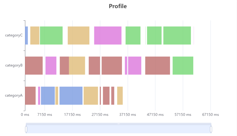
圖表來源:https://echarts.apache.org/examples/zh/editor.html?c=custom-profile (opens new window)
FastWeb TUgURLFrame示例:
如需在FastWeb中的TUgURLFrame中實現上述效果,則修改其HTML屬性,使用下列內容:
<!DOCTYPE html>
<html>
<head>
    <meta charset="utf-8">
    <title>ECharts</title>
    <!-- 引入 echarts.js -->
    <script src="https://cdn.staticfile.org/echarts/5.1.2/echarts.min.js"></script>
</head>
<body>
    <!-- 為ECharts準備一個具備大小(寬高)的Dom -->
    <div id="main" style="width: 800px;height:500px;"></div>
    <script type="text/javascript">
        // 基於準備好的dom,初始化echarts實體
        var myChart = echarts.init(document.getElementById('main'));
        var option;

        var data = [];
        var dataCount = 10;
        var startTime = +new Date();
        var categories = ['categoryA', 'categoryB', 'categoryC'];
        var types = [
            {name: 'JS Heap', color: '#7b9ce1'},
            {name: 'Documents', color: '#bd6d6c'},
            {name: 'Nodes', color: '#75d874'},
            {name: 'Listeners', color: '#e0bc78'},
            {name: 'GPU Memory', color: '#dc77dc'},
            {name: 'GPU', color: '#72b362'}
        ];

        // Generate mock data
        categories.forEach(function (category, index) {
            var baseTime = startTime;
            for (var i = 0; i < dataCount; i++) {
                var typeItem = types[Math.round(Math.random() * (types.length - 1))];
                var duration = Math.round(Math.random() * 10000);
                data.push({
                    name: typeItem.name,
                    value: [
                        index,
                        baseTime,
                        baseTime += duration,
                        duration
                    ],
                    itemStyle: {
                        normal: {
                            color: typeItem.color
                        }
                    }
                });
                baseTime += Math.round(Math.random() * 2000);
            }
        });

        function renderItem(params, api) {
            var categoryIndex = api.value(0);
            var start = api.coord([api.value(1), categoryIndex]);
            var end = api.coord([api.value(2), categoryIndex]);
            var height = api.size([0, 1])[1] * 0.6;

            var rectShape = echarts.graphic.clipRectByRect({
                x: start[0],
                y: start[1] - height / 2,
                width: end[0] - start[0],
                height: height
            }, {
                x: params.coordSys.x,
                y: params.coordSys.y,
                width: params.coordSys.width,
                height: params.coordSys.height
            });

            return rectShape && {
                type: 'rect',
                transition: ['shape'],
                shape: rectShape,
                style: api.style()
            };
        }


        option = {
            tooltip: {
                formatter: function (params) {
                    return params.marker + params.name + ': ' + params.value[3] + ' ms';
                }
            },
            title: {
                text: 'Profile',
                left: 'center'
            },
            dataZoom: [{
                type: 'slider',
                filterMode: 'weakFilter',
                showDataShadow: false,
                top: 400,
                labelFormatter: ''
            }, {
                type: 'inside',
                filterMode: 'weakFilter'
            }],
            grid: {
                height: 300
            },
            xAxis: {
                min: startTime,
                scale: true,
                axisLabel: {
                    formatter: function (val) {
                        return Math.max(0, val - startTime) + ' ms';
                    }
                }
            },
            yAxis: {
                data: categories
            },
            series: [{
                type: 'custom',
                renderItem: renderItem,
                itemStyle: {
                    opacity: 0.8
                },
                encode: {
                    x: [1, 2],
                    y: 0
                },
                data: data
            }]
        };

        // 使用剛指定的配置項和數據顯示圖表。
        myChart.setOption(option);
    </script>
</body>
</html>
2
3
4
5
6
7
8
9
10
11
12
13
14
15
16
17
18
19
20
21
22
23
24
25
26
27
28
29
30
31
32
33
34
35
36
37
38
39
40
41
42
43
44
45
46
47
48
49
50
51
52
53
54
55
56
57
58
59
60
61
62
63
64
65
66
67
68
69
70
71
72
73
74
75
76
77
78
79
80
81
82
83
84
85
86
87
88
89
90
91
92
93
94
95
96
97
98
99
100
101
102
103
104
105
106
107
108
109
110
111
112
113
114
115
116
117
118
119
120
121
122
123
124
125
126
127
128
129
130
131
132
133
134
更多的例子參見:自定義示例 (opens new window)
下面來介紹開發者怎麼使用 自定義系列(custom series)。
# 1. renderItem 方法
開發者自定義的圖形元素渲染邏輯,是通過書寫 renderItem 函式實現的,例如:
var option = {
    ...,
    series: [{
        type: 'custom',
        renderItem: function (params, api) {
            // ...
        },
        data: data
    }]
}
2
3
4
5
6
7
8
9
10
在渲染階段,對於 series.data 中的每個數據項(為方便描述,這裡稱為 dataItem),會呼叫此 renderItem 函式。這個 renderItem 函式的職責,就是返回一個(或者一組)圖形元素定義,圖形元素定義 中包括圖形元素的型別、位置、尺寸、樣式等。echarts 會根據這些 圖形元素定義 來渲染出圖形元素。如下的示意:
var option = {
    ...,
    series: [{
        type: 'custom',
        renderItem: function (params, api) {
            // 對於 data 中的每個 dataItem,都會呼叫這個 renderItem 函式。
            // (但是注意,並不一定是按照 data 的順序呼叫)

            // 這裡進行一些處理,例如,座標轉換。
            // 這裡使用 api.value(0) 取出目前 dataItem 中第一個維度的數值。
            var categoryIndex = api.value(0);
            // 這裡使用 api.coord(...) 將數值在目前座標系中轉換成為螢幕上的點的畫素值。
            var startPoint = api.coord([api.value(1), categoryIndex]);
            var endPoint = api.coord([api.value(2), categoryIndex]);
            // 這裡使用 api.size(...) 獲得 Y 軸上數值範圍為 1 的一段所對應的畫素長度。
            var height = api.size([0, 1])[1] * 0.6;

            // shape 屬性描述了這個矩形的畫素位置和大小。
            // 其中特殊得用到了 echarts.graphic.clipRectByRect,意思是,
            // 如果矩形超出了當前座標系的包圍盒,則剪裁這個矩形。
            // 如果矩形完全被剪掉,會返回 undefined.
            var rectShape = echarts.graphic.clipRectByRect({
                // 矩形的位置和大小。
                x: startPoint[0],
                y: startPoint[1] - height / 2,
                width: endPoint[0] - startPoint[0],
                height: height
            }, {
                // 目前座標系的包圍盒。
                x: params.coordSys.x,
                y: params.coordSys.y,
                width: params.coordSys.width,
                height: params.coordSys.height
            });

            // 這裡返回為這個 dataItem 構建的圖形元素定義。
            return rectShape && {
                // 表示這個圖形元素是矩形。還可以是 'circle', 'sector', 'polygon' 等等。
                type: 'rect',
                shape: rectShape,
                // 用 api.style(...) 得到預設的樣式設定。這個樣式設定包含了
                // option 中 itemStyle 的配置和視覺對映得到的顏色。
                style: api.style()
            };
        },
        data: [
            [12, 44, 55, 60], // 這是第一個 dataItem
            [53, 31, 21, 56], // 這是第二個 dataItem
            [71, 33, 10, 20], // 這是第三個 dataItem
            ...
        ]
    }]
}
2
3
4
5
6
7
8
9
10
11
12
13
14
15
16
17
18
19
20
21
22
23
24
25
26
27
28
29
30
31
32
33
34
35
36
37
38
39
40
41
42
43
44
45
46
47
48
49
50
51
52
53
renderItem 函式提供了兩個參數:
- params:包含了目前數據資訊(如
seriesIndex、dataIndex等等)和座標系的資訊(如座標系包圍盒的位置和尺寸)。 - api:是一些開發者可呼叫的方法集合(如
api.value()、api.coord())。
renderItem 函式須返回根據此 dataItem 繪製出的圖形元素的定義資訊,參見 renderItem.return。
一般來說,renderItem 函式的主要邏輯,是將 dataItem 里的值對映到座標系上的圖形元素。這一般需要用到 renderItem.arguments.api 中的兩個函式:
- api.value(...),意思是取出
dataItem中的數值。例如api.value(0)表示取出目前dataItem中第一個維度的數值。 - api.coord(...),意思是進行座標轉換計算。例如
var point = api.coord([api.value(0), api.value(1)])表示dataItem中的數值轉換成座標系上的點。
有時候還需要用到 api.size(...) 函式,表示得到座標系上一段數值範圍對應的長度。
返回值中樣式的設定可以使用 api.style(...) 函式,他能得到 series.itemStyle 中定義的樣式資訊,以及視覺對映的樣式資訊。也可以用這種方式覆蓋這些樣式資訊:api.style({fill: 'green', stroke: 'yellow'})。
書寫完 renderItem 方法后,自定義系列的 90% 工作就做完了。剩下的是一些精化工作。
# 2. 使座標軸的範圍自適應數據範圍
在 直角座標系(grid)、極座標系(polar) 中都有座標軸。座標軸的刻度範圍需要自適應目前顯示出的數據的範圍,否則繪製出的圖形會超出去。所以,例如,在 直角座標系(grid) 中,使用自定義系列的開發者,需要設定,data 中的哪些維度會對應到 x 軸上,哪些維度會對應到 y 軸上。這件事通過 encode 來設定。例如:
option = {
    series: [{
        type: 'custom',
        renderItem: function () {
            ...
        },
        encode: {
            // data 中『維度1』和『維度2』對應到 X 軸
            x: [1, 2],
            // data 中『維度0』對應到 Y 軸
            y: 0
        },
        data: [
            // 維度0  維度1  維度2  維度3
            [   12,   44,   55,   60   ], // 這是第一個 dataItem
            [   53,   31,   21,   56   ], // 這是第二個 dataItem
            [   71,   33,   10,   20   ], // 這是第三個 dataItem
            ...
        ]
    }]
};
2
3
4
5
6
7
8
9
10
11
12
13
14
15
16
17
18
19
20
21
# 3. 設定 tooltip
當然,使用 tooltip.formatter 可以任意定製 tooltip 中的內容。但是還有更簡單的方法,通過encode 和 dimensions 來設定:
option = {
    series: [{
        type: 'custom',
        renderItem: function () {
            ...
        },
        encode: {
            x: [1, 2],
            y: 0,
            // 表示『維度2』和『維度3』要顯示到 tooltip 中。
            tooltip: [2, 3]
        },
        // 表示給『維度2』和『維度3』分別取名為『年齡』和『滿意度』,顯示到 tooltip 中。
        dimensions: [null, null, '年齡', '滿意度'],
        data: [
            // 維度0  維度1  維度2  維度3
            [   12,   44,   55,   60   ], // 這是第一個 dataItem
            [   53,   31,   21,   56   ], // 這是第二個 dataItem
            [   71,   33,   10,   20   ], // 這是第三個 dataItem
            ...
        ]
    }]
};
2
3
4
5
6
7
8
9
10
11
12
13
14
15
16
17
18
19
20
21
22
23
上面,一個簡單的 custome series 例子完成了。
下面介紹幾個其他細節要點。
# 4. 超出座標系範圍的擷取
與 dataZoom 結合使用的時候,常常使用會設定 dataZoom.filterMode 為 'weakFilter'。這個設定的意思是:當 dataItem 部分超出座標系邊界的時候,dataItem 不會整體被過濾掉。例如:
option = {
    dataZoom: {
        xAxisIndex: 0,
        filterMode: 'weakFilter'
    },
    series: [{
        type: 'custom',
        renderItem: function () {
            ...
        },
        encode: {
            // data 中『維度1』和『維度2』對應到 X 軸
            x: [1, 2],
            y: 0
        },
        data: [
            // 維度0  維度1  維度2  維度3
            [   12,   44,   55,   60   ], // 這是第一個 dataItem
            [   53,   31,   21,   56   ], // 這是第二個 dataItem
            [   71,   33,   10,   20   ], // 這是第三個 dataItem
            ...
        ]
    }]
};
2
3
4
5
6
7
8
9
10
11
12
13
14
15
16
17
18
19
20
21
22
23
24
在這個例子中,『維度1』和『維度2』對應到 X 軸,dataZoom 元件控制 X 軸的縮放。假如在縮放的過程中,某個 dataItem 的『維度1』超出了 X 軸的範圍,『維度2』還在 X 軸的範圍中,那麼只要設定 dataZoom.filterMode = 'weakFilter',這個 dataItem 就不會被過濾掉,從而還能夠使用 renderItem 繪製圖形(可以使用上面提到過的 echarts.graphic.clipRectByRect 把圖形繪製成被座標系剪裁過的樣子)。參見上面提到過的例子:Profile
# 5. 關於 dataIndex
開發者如果使用到的話應注意,renderItem.arguments.params 中的 dataIndex 和 dataIndexInside 是有區別的:
dataIndex指的dataItem在原始數據中的 index。dataIndexInside指的是dataItem在目前數據視窗(參見 dataZoom)中的 index。
renderItem.arguments.api 中使用的參數都是 dataIndexInside 而非 dataIndex,因為從 dataIndex 轉換成 dataIndexInside 需要時間開銷。
# 6. 事件監聽
chart.setOption({
    // ...
    series: {
        type: 'custom',
        renderItem: function () {
            // ...
            return {
                type: 'group',
                children: [{
                    type: 'circle'
                    // ...
                }, {
                    type: 'circle',
                    name: 'aaa',
                    // 使用者指定的資訊,可以在 event handler 訪問到。
                    info: 12345,
                    // ...
                }]
            };
        }
    }
});
chart.on('click', {element: 'aaa'}, function (params) {
    // 當 name 為 'aaa' 的圖形元素被點選時,此回撥被觸發。
    console.log(params.info);
});
2
3
4
5
6
7
8
9
10
11
12
13
14
15
16
17
18
19
20
21
22
23
24
25
26
# 7. 自定義向量圖形
自定義系列能支援使用 SVG PathData (opens new window) 定義向量路徑。從而可以使用向量圖工具中做出的圖形。參見:path,以及例子:icons 和 shapes。
更多的自定義系列的例子參見:自定義示例 (opens new window)